| Author | Thread |
Comments Made During the Challenge  |
|
|
06/17/2007 11:52:02 PM |
|
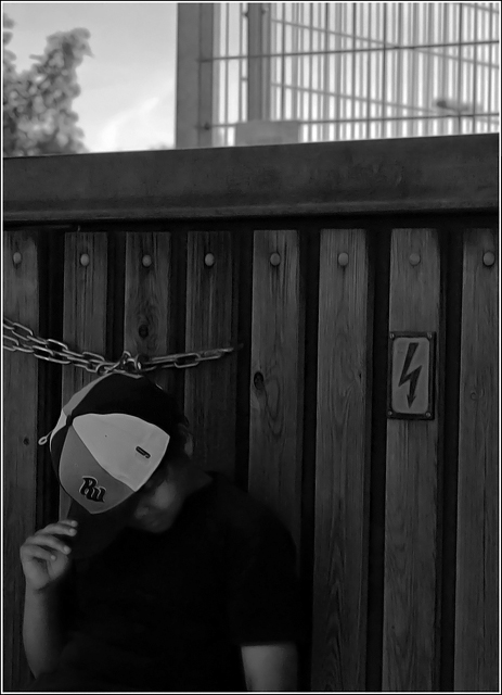
just too dark for me... Maybe crop the sky off and play with brightness for jsut the fence and the boy?? |
|
|
|
06/16/2007 05:48:07 PM |
|
I think the bright spot above the fence draws away from your main subject. |
|
|
|
06/15/2007 06:30:24 PM |
This is very underexposed... I would love to see the detail that is almost there.
TC |
|
|
|
06/14/2007 03:01:26 PM |
|
A little too dark at the bottom of the photo for my taste.. |
|
|
|
06/14/2007 06:43:01 AM |
|
To dark to see any detail of the main subject |
|
|
|
06/13/2007 03:13:34 PM |
|
I think it is an interesting shot, but there is so much detail lost in the dark sections, it is difficult for me to tell. |
|
|
|
06/13/2007 08:15:19 AM |
|
Much too dark. Can't even see the subject, though your detail on the background came out very nice. |
|
|
|
06/11/2007 08:06:09 PM |
|
A bit too dark on my screen .... |
|
|
|
06/11/2007 05:55:51 PM |
|
Not overly sure about this image and the title (which I dont mark on) doesnt really seem to clarify matters, do love the focus and textures of the grain behind the subject |
|
|
|
06/11/2007 02:39:06 PM |
|
Just a bit too dark. I would have liked to see his face a little better. |
|
|
|
06/11/2007 07:35:21 AM |
|
Not sure what you've done, but the processng on the face looks VERY odd. |
|
|
|
06/11/2007 05:40:43 AM |
|
Not sure about the processing over his face. |
|
|
|
06/11/2007 05:13:11 AM |
|
This looks like it's been NeatImaged to death. The texture on the face is awful. Either that, or an ill-advised filter. Not sure about the composition, and it's usually not good to chop off at the elbow. |
|
Home -
Challenges -
Community -
League -
Photos -
Cameras -
Lenses -
Learn -
Help -
Terms of Use -
Privacy -
Top ^
DPChallenge, and website content and design, Copyright © 2001-2026 Challenging Technologies, LLC.
All digital photo copyrights belong to the photographers and may not be used without permission.
Current Server Time: 07/15/2026 07:21:55 PM EDT.