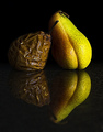
Very nice image - I'm a little bothered by the hit whites on the one facing the key - I'm surprised you didn't have a go at remedying that... Beyond that little bit, I like it very much!
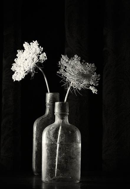
Great texture - I love the glass bottles! Having the flower heads pointing different ways works well - and the title is great. Wish there weren't quite such a different between the lighting on the left and right flowers - makes my eye feel the one on the left is too bright, the one on the right is too dark - and neither is really too anything except in contrast with eachother.
I like the B&W treatment here. Nice side-lighting and position of the bottles. A little more light on that right hand flower would have made this much better.
Fit Challenge Criteria: 2/2
Contrast/Color: 1/2
Composition: 1/2
Photo Quality: 1/2
My Subjective Affinity: 0/2
I really like how the bottles are slightly reflected on the surface, and wish I could see more of that. I also think it would look better with a bit more of the second bottle showing. The placement of the twigs pointing in different directions helps the photo out, but the lighting is a bit too harsh.
i like this a lot, beautiful low key and composition. the lighting is working really well in this picture, i like that the flowers are different tones, one more in shadow.






 Add photograph to your favorites
 Add photographer to your favorites

 Photographer found comment helpful.


