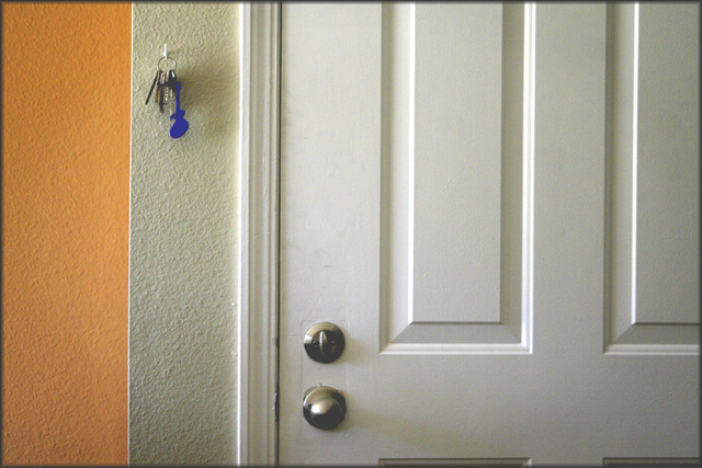
Good start to the challenge; you've captured the natural lighting well, and there's lots of interest to the image from the lines, the keys and the handle/lock.
One of the reasons this works so well color-wise is because orange and blue are opposites on the color wheel. When using opposites it creates excitement in a shot. And you've done this very well.
I like the contrast of blue/orange, and how you included both the keys and lock. I think some of the other commenters have a good point about a tighter shot. Perhaps a portrait orientation so that you could still include the handle and keys with some of the color? I think a slight adjustment in levels or contrast would help boost the colors too! Great start!
Sean, I like this photo very much, especially the composition (the bands of color and the lines), though it either needs a teeny bit of rotation or straightening to compensate for distortion. Very cool.




 Add photograph to your favorites
 Add photographer to your favorites

 Photographer found comment helpful.


