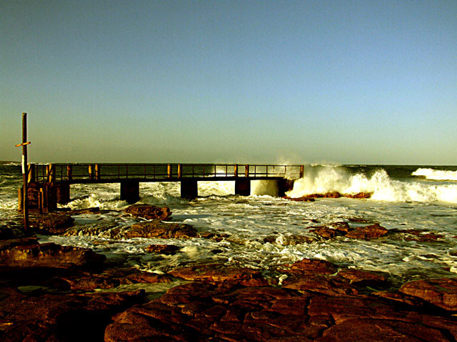
Hate to be cruel, but this needs some serious help in the post-processing, as the overall tones are far too yellow. In regards to the composition, there are two main focal points - the wave crashing and the upright pole on the left side. A tighter crop so the pier/jetty starts out of the frame would probably have been better so there isn't competition for where my eyes are drawn. The other issue is the noise levels in the sky - affects the overall quality a lot.
If you need help in post-processing or links to tips, tutorials and help, please don't hesitate to PM me during or after the challenge.
I have not voted on this image, but would be in the 3-4 range.
the composition of this image is really pretty good but the white balance seems off and the sky is very noisy. Both should be fixable in advanced editing.
Horizon is too centred and results in an image that is too static. Try having the horizon higher or lower, and see which ofthose compositions works best. IMO, if the horizon was higher, it would have been better because the rocks at the bottom are very interesting. 8
This shot has potential but it is not very clear. The rocks and foamy water look a bit over-sharpened and the sky is splotchy. Almost has a camera phone quality in that sense.







 Add photograph to your favorites
 Add photographer to your favorites


 Photographer found comment helpful.


