| Author | Thread |
|
|
12/31/2003 09:00:56 PM |
Originally posted by Truegsht:
Sorry, that is my little rant on this. Why must there always be a focal point, a border? |
Maybe I can give you an answer to your question:
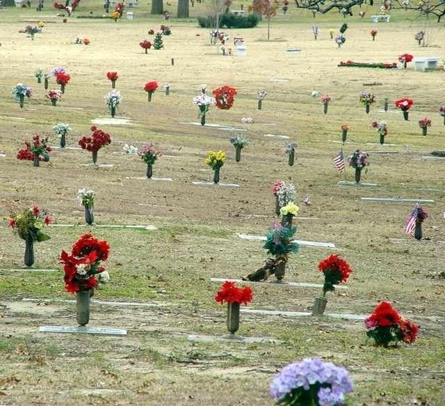
By the nature of photography, i.e. it's limited space on a paper or screen, it has boarders. So your submission has of course borders on all four sides. And because of that, especially when you want to show "no boundaries", you have to choose them very well, otherwise your intention does not get to the viewer.
The way you cropped/non-cropped the picture gave it a strong border: the cemetary ends for the viewer at the bush and trees at the very top.
Cropping it away would give them the feeling the cemetary goes on for ever.
Simillar issues are for the focal-point: if one views an image, the eye always walks arround to find something special. Nobody can avoid that. If there is nothing of interest the viewer looses interest.
In your image there are several foreground objects that are rather uninteresting or even disturbing (the blue flower at the very bottom).
So there would be two option to avoid this: have a focal point which is crisp and well defined and the surrounding gets less important.
Or, and that probably fits better here, have no focal point, but repating structures, which give symmetry and texture. The middle section of your image has this feature and its often seen on great images of military cemetaries.
Hope I could answer your question a little,
Jörg
Message edited by author 2003-12-31 21:01:42. |
|
 Photographer found comment helpful. Photographer found comment helpful. |
|
|
12/31/2003 08:41:26 AM |
|
There are no guiding lines or resting places...due to the challenge! It is supposed to be about boundaries...if there are no set boundaries, then this photo is all about that. I know I may be a newbie to photography, but I interpreted this to show that there are really no boudaries. Alot of people here think this didn't fit because it did not have a "SET" line or boundary, or saying it isn't cropped with a pretty line. That is in of itself placing a boundary on the interpretation of this photo. Sorry, that is my little rant on this. Why must there always be a focal point, a border? |
|
Comments Made During the Challenge  |
|
|
12/30/2003 08:38:35 PM |
I don't see how it fits the challenge other than the title and that don't fit it too well. This shot has no real focus. It's confusing to the eye, there's no where to come to a rest and no guiding lines.
TC |
|
|
|
12/30/2003 07:02:29 PM |
|
I like the telephoto use on this shot. |
|
| Photographer found comment helpful. |
|
|
12/30/2003 01:10:51 PM |
|
There does not seem to be a focal point in this photo. It is cropped or not cropped in an unsightly way at the top of the photo. The color is poor pehaps a bit of saturation might have helped. |
|
|
|
12/30/2003 10:03:49 AM |
|
Should have cropped more of the top |
|
|
|
12/29/2003 09:42:44 PM |
|
that being the case, show something else. |
|
|
|
12/29/2003 05:31:56 AM |
While the image fits well to the challenge (bounderies, transition), it could have been improved by a tighter cropping at the top and maybe a desaturation of all colors except red. Also a black boarder might have worked well here.
As it is now, it looks a little "snap-shooty". |
|
|
|
12/27/2003 08:32:54 PM |
|
Try this shot with a shallower DOF and I think it will look a little better. May try cropping it so it isn't so square either. |
|
|
|
12/24/2003 07:10:21 AM |
|
I think I'd have liked this better had you focused more on one grave - perhaps one with some interest - a flag, a child's toy - something to draw you in. |
|
Home -
Challenges -
Community -
League -
Photos -
Cameras -
Lenses -
Learn -
Help -
Terms of Use -
Privacy -
Top ^
DPChallenge, and website content and design, Copyright © 2001-2026 Challenging Technologies, LLC.
All digital photo copyrights belong to the photographers and may not be used without permission.
Current Server Time: 06/29/2026 11:49:35 PM EDT.