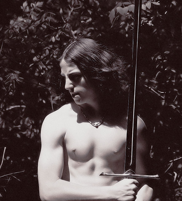
oh well .. it didnt do real good in the challenge, but its a great image and interesting as well ... this must be your very handsome son ?? .. you really have some excellent models to choose from, in fact, why dont you get rudy to pose in some of your shots!!!!!!!!!! ..:):)
Very retro feel. The lighting is a little out-of the box, but overall I think this is relatively effective. Having said that I would like to see more emphasis on the face and less on the torso. Also, the crop is a little strange at the bottom - I don't know why you've cut the image so close to the bottom of the arm.
There's something discomforting here - perhaps as simple as the crop along the bottom of the arm there being so close to the frame's edge. Given the tightness of that crop, perhaps the space you've allowed elsewhere emphasises that the more.
Good capture of the theme, contrasting the "darkened" sword against the white flesh. I normally don't like sepia or other tinted effects, but it works well here. Good body on your model! Ah, to be young again. :-/





 Add photograph to your favorites
 Add photographer to your favorites

 Photographer found comment helpful.


