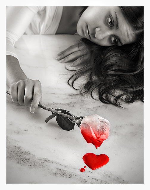
My main goal here was to make the desaturation itself part of the story. The idea was to have the color/life draining out of a rose. Special thanks to Michelle for modeling!
I used a peach-colored rose to allow light tones at the top, and the heart was red tempera paint applied with a spoon and toothpick (including a drip on the bottom edge of the rose).
Processing: Convert from RAW at two different settings for more dynamic range, Levels, Channel Mixer conversion to B&W, History Brush the color back into the paint and rose, Colorize/Color Burn the rose and desaturate the top, lots of Dodge & Burn, Curves, light Noise Ninja and several rounds of USM.
Statistics
Place: 10 out of 556 Avg (all users): 6.5947 Avg (commenters): 8.2778 Avg (participants): 6.5371 Avg (non-participants): 6.7885 Views since voting: 9349 Views during voting: 397 Votes: 227 Comments: 35 Favorites: 19 (view)
An amazing idea. This was my favorite concept shot from the whole challenge. Easily made my top10 list. So glad you made it in but thought it'd place higher.
This is the one I pegged at #1 when I was voting. Even though I normally don't pick the winners, I think the running of the DPL pushed this one down which is a shame because this one is very good on all levels.
This is the one I pegged at #1 when I was voting. Even though I normally don't pick the winners, I think the running of the DPL pushed this one down which is a shame because this one is very good on all levels.
Great image. The composition really works - everything in the frame draws your eye to that spot of colour. The heart is a bit gimmicky, but I'll overlook that, because I really like the concept you've used of colour bleeding out of the rose. Nicely executed.
The selective desaturation really enhances the concept you went for. almost like the "color" in her is draining away. Great lighting, composition, and tones. Should do very well ;), 8







 Add photograph to your favorites
 Add photographer to your favorites

 Photographer found comment helpful.


