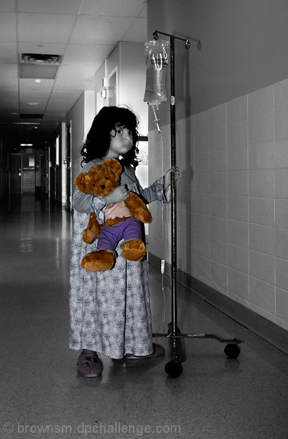
taken in the hallway at work. Meant to look like a girl alone in a hospital hallway, holding onto her bear, her hope.
PP: slight crop, layers for levels, curves, black and white layer (masked for bear at 100%, then masked for nightgown and slippers at 20%). Flatten, USM at large radius, resize, slight USM at small radius, save for web.
Statistics
Place: 111 out of 556 Avg (all users): 5.8690 Avg (commenters): 7.8571 Avg (participants): 5.7809 Avg (non-participants): 6.1765 Views since voting: 1061 Views during voting: 324 Votes: 229 Comments: 13 Favorites: 0
Great leading lines in this shot. The line of the wall takes the viewer into the frame as does the ceiling tiles.
Lighting is pretty good. Previous commenters said not to use a flash. For me the shadows actually work here as it lends to an overall dark feeling that helps create a mood. I like that the hallway behind her becomes quite dark and is symbolic of the child's fears. The light in the doorway behind her help separate her from the background nicely.
Exposure is pretty good. A larger aperture would have helped separate the subject from the background more but I kinda like the detail in the background anyways for this shot.
The challenge: As mentioned previously, some voters might have felt that this was a staged shot. In the two second view of some voters, they have also not understood why the bear was desaturated. The average score given by commenters shows that the viewer needs to look at this shot for a while to really "get it"
i don't really understand the scoring here... this is a real, heartwarming and technically sound photo. maybe it's a bit too centred, and maybe the blacks should be a bit darker to add to the mood, but overall this is a 6.4 or 6.5 to me.
Positives: Exceptional technical quality and your selective desaturation sends a clear message for such a youthful and understandably unhappy model.
Technicals: Tones, lighting and color are all good. lighting is very nice, overall quality is well above average for DPC. Looks like you have created a slight blue overtone in the BW(greyscale) portion of your image. Looks nice, intended or not.
You did an exceptional job with the boundary between color and black and white. That is the toughest part of selective desaturation.
Technically this is a good image. The BW tones are well captured.
The Challenge: You scored almost .5 above the challenge average in one with an exceptionally narrow range of voting and many poor image submissions. Commenters gave it almost an 8. That is very good. Overall, voters thought this a good image despite what you or I might think about the actual average score it received.
Perhaps some voters felt it was a setup and that is why it scored so low.
Great image Steve but I think many people don't really like selective desaturation very much and all scores suffered. I gave it an 8 during the challenge.
I gave this a ten during the challenge; that it didn't do better sort of astounds me (but I'm regularly out of sync with DPC voters, as my own scores show). It tells an incredibly powerful story, and I found the composition, the tones in the conversion, and the technicals to support that story (which does overshadow the image somewhat, but in a good way). Sorry it didn't do better.
very great moment, great composition. you should submit this to Children's Hospital or something, they would be able to use it in brochures and things of that nature. great image






 Add photograph to your favorites
 Add photographer to your favorites

 Photographer found comment helpful.


