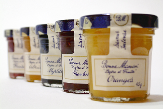
45 gram /1.6 ounce mini marmelade jars. They are 4 to 5cm high and 3cm wide or so.
Camera setup:
Macro mode, manual focus, manual whitebalance, telephoto end of the lens.
Light setup: 3 lights overhead and loads of reflectors and diffusers.
Background: white photography carboard, curved upwards to get an edgeless background.
Photoshop: *= December editing rule step
- Chroma Noise Reduction
- Levels
- *Select shadows, copy to new layer, screen mode, 70% opacity, flatten
- Crop 3:2
- *clone tool: Dust taken of the background
- *clone tool: Removed one reflection from the front jar
- *new layer, overlay mode, 50% gray -> dodge on the left shadow and the in-focus jar
- Digital Velvia at setting 2 (curves and channel mixing applied to the whole image)
- *Unsharp Mask, but only on the in-focus jar
- Save for the web at 97%
Statistics
Place: 48 out of 165 Avg (all users): 5.7328 Avg (commenters): 7.0909 Avg (participants): 5.7363 Avg (non-participants): 5.7250 Views since voting: 2224 Votes: 131 Comments: 13 Favorites: 2 (view)
The idea of lining up the jars is great, and the overall mix of colors is effective, and the shapes make a nice composition. I think it might have been more effective to have your sharpest focus at the front, at least two jars in sharp focus, and then the falloff toward the back of the photo.
This has a really different feel to many other entries and I can this kind of studio shot appearing in magazine adverts etc. Good use of DOF and a nice simple arrangement and perspective.
Technical: fits the challenge. Exposure composition lighting all good. I'm not crazy about the choice made for the focus.
Personal: My eye immediately went to the closest jar and was confused by the lack of focus. Then I realized the second jar was in focus but that I can't read it's label. The others are barely readable, which makes this shot interesting but frustrating to me.






 Add photograph to your favorites
 Add photographer to your favorites


 Photographer found comment helpful.


