| Author | Thread |
|
|
09/10/2002 11:42:00 AM |
|
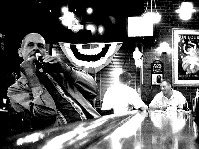
I did not get to vote on this challenge:( I just wanted to say this is a great shot! |
|
Comments Made During the Challenge  |
|
|
09/08/2002 08:27:00 PM |
|
Great photo! I love the blurrd lighting and depth. Wonderful composition as well. |
|
|
|
09/08/2002 12:12:00 AM |
|
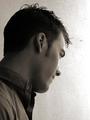
There's something very cool about this photo. It's the combination of that beutiful high contrast black and white, the pose of the man in the foreground, the political overtones of the banner in the background in association with the look of the two men in the back who seem to be locked in quite an intense discussion, and the rest of the surroundings. There's a kind of tension there that runs through everything. Nice work, 10 - lisae |
|
|
|
09/07/2002 01:32:00 AM |
|
This picture is hard on the eyes because of all the glare-back. It gets in the way of the message - loneliness? |
|
|
|
09/07/2002 12:00:00 AM |
|
I like the b&w, and i think the glare is effective. The image is not interesting enuf to me to be an effective "candid" 4 sjgleah |
|
|
|
09/06/2002 07:37:00 PM |
|
All three men have photo difficulties: the man in foreground is a bit dark and grainy, the man with his back to you has his shirt washed out and the man at the end of the bar moved (blurred). I like this concept, but the above issues are hard to overlook. 7 Swash |
|
|
|
09/06/2002 12:52:00 PM |
|
That guy looks like he is getting ready to hit you! I know this should be a relaxed laid back place, but the bw and high contrast gives it a tense feeling to me. I like how the bar pulls the eyes from the guy on the left to the guys at the end (at least it does me). karmat |
|
|
|
09/05/2002 11:14:00 PM |
|
On one hand, the guy in the foreground puts me off from this photo. It seems as if he's posing for the camera. However, I'm more interested in the two people at the end of the bar enjoying a casual conversation with some pints. A nicely framed shot of the guy facing you with the pint in the shot would have definitely worked. I do like that you went with B&W on this as it gives a nostalgic feel overall... |
|
|
|
09/05/2002 10:27:00 PM |
|
Face us good... unfortunately a bit too busy though |
|
|
|
09/05/2002 09:14:00 PM |
|
Poor dude! It is a little hard to make out the bottle in his hand... it almost looks like he's shoving it up his nose a little bit. But otherwise, I like it a lot. Looks straight out of the 50s. |
|
|
|
09/05/2002 06:28:00 AM |
|
This must have been difficult to shoot with those lights. |
|
|
|
09/05/2002 01:10:00 AM |
|
A little too high contrast I think. But good composition. |
|
|
|
09/04/2002 11:24:00 PM |
|
The guy on the left is really interesting. All the bright white areas bother me. Tough lighting situation. Interesting angle. Good representation of the challenge. ~indigo997 |
|
|
|
09/04/2002 03:47:00 PM |
|
yes, yes! i just love this!! the overall mood of this photo is astounding---from the decor of the bar to the overblown lighting--the kind of grainy black and white...and of course the framing highlighting the single guy. i even find myself wondering how awesome it would look if the other two guys weren't in the picture? but who cares! a 10 for you! --amitchell |
|
|
|
09/04/2002 02:42:00 PM |
One of two excellent bar candids this week. As with the other submission, I really like this one in black and white, overexposed and somewhat grainy because so much emotion and atmosphere is created. I especially like the perspective and the closeness of this subject because it lets us see his features and his eyes and makes us wonder what he's thinking about (which is also helped by your title). Great shot.
Score: 10
Courtenay |
|
|
|
09/04/2002 11:40:00 AM |
|
What this man about to slug you? I really like this picture and the background is as interesting as the main subject. |
|
|
|
09/04/2002 08:19:00 AM |
|
The white are a little too saturated to my test but I am nopt sure you could (or wanted) do it differently. Otherwise nice shot, in the spirit of the challenge, good composition , bood black & W. 7. Lionel |
|
|
|
09/04/2002 01:10:00 AM |
mood captured - bitter
sincerity of expressions - good |
|
|
|
09/04/2002 12:46:00 AM |
|
a bit grainy and overblown in places, but this has a great feel. (9) ~mcmurma |
|
|
|
09/04/2002 12:29:00 AM |
|
This is truly a piece of art. The grain is unquestionably intentional and adds volumes to the surreal setting. The blur of the bar counter is showing incredible control without distortion to the subjects near and far. The harsh lighting and the positioning add an artsy look to a seemingly old atmosphere. Truly a masterful shot. Congrats on one of my favorites for this challenge. I fear the masses may not give this the credit it deserves. The voters tend to be a little hard on blur, grain and Black/White ? all of the same elements I commend you on for this shot. Good Luck, Gotcha |
|
|
|
09/03/2002 10:46:00 PM |
|
i really like this photo, the atmosphere really jumps out of this photo. the only thing i don't really like about it is the weird way the man seems to be trying to get out of the way. but other than that its great, 9 |
|
|
|
09/03/2002 07:59:00 PM |
Composition: Subject Placement, Cropping, Background6,
Technical: Focus, Exposure, Lighting, Processing6,
Appeal: Is it Interesting, Motivating, Etc.? 4,
Total Averaged Rating5. Autool
|
|
|
|
09/03/2002 04:27:00 PM |
|
I little bit contrasty, but interesting. it may have been better to concentrate on the man in the foreground. |
|
|
|
09/02/2002 11:48:00 PM |
|
I dont know how much was cropped out. This might bave been better with the guys in the BG cropped higher in the frame. |
|
|
|
09/02/2002 08:48:00 PM |
|
ahh, the old mirror trick. I like it in B/W----9 |
|
|
|
09/02/2002 08:24:00 PM |
|
Great shot. I love the black and white. |
|
|
|
09/02/2002 08:20:00 PM |
|
great depth..and composition...like the lights and reflection on the bar. works well in B&W. |
|
|
|
09/02/2002 04:15:00 PM |
|
Love the light, reflection, mood. Nice job. Score 7 Justine |
|
|
|
09/02/2002 03:49:00 PM |
|
I really like this shot..terrific subject matter. The contrast is a bit too harsh to me but that may be the effect that you were going for. Also, the dof is a little shallow but I know that shooting complete strangers in a dark bar was challenging enough! I think this is one of my favorites this week...great job! -KrazyKat |
|
|
|
09/02/2002 02:12:00 PM |
|
this is definelty a cool black and white!! definetly candid..did u overexpose or saturate to get tose bleeding highlights?? 7--shutterfly |
|
|
|
09/02/2002 01:28:00 PM |
Composition 10
Originality 10
Technical Aspects 8 (I think the highlights look a little blown out)
Meets Challenge 10
Total Score 10
-Konador |
|
|
|
09/02/2002 11:44:00 AM |
|
Love the mood and composition. B&W works for me, but there are so many hot spots. Wow. |
|
|
|
09/02/2002 05:56:00 AM |
|
This is a great shot in many respects. But, it does look like the character in the foreground is leaning back to get out of the central shot. This gives the image a contrived unnatural atmosphere. Sorry to sound so negative and good luck… |
|
|
|
09/02/2002 05:16:00 AM |
|
|
|
09/02/2002 02:30:00 AM |
|
aren't we idiots when we drink too much |
|
|
|
09/02/2002 01:57:00 AM |
|
It looks like he is trying to dodge the camera a little. I think this would have been a hard picture to take and you've done it good. I'd think that a bar is a low light place but you've done good at keeping the blur down. |
|
|
|
09/02/2002 01:32:00 AM |
|
this is a very well done photo in my opinion.. the contrast is good. B&W a good choice, otherwise too many colors would distract.. the man having his back to the camera is a small thing that bugs, only because his shirt is so bright it kinda takes you from the rest of the photo.. but i like it. Good job, 8 |
|
Home -
Challenges -
Community -
League -
Photos -
Cameras -
Lenses -
Learn -
Help -
Terms of Use -
Privacy -
Top ^
DPChallenge, and website content and design, Copyright © 2001-2026 Challenging Technologies, LLC.
All digital photo copyrights belong to the photographers and may not be used without permission.
Current Server Time: 06/29/2026 08:24:36 AM EDT.