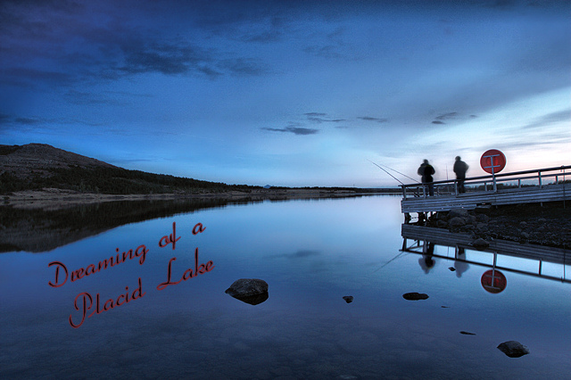
1. Curves and clarify on the sky and reflection.
2. Fade correction on the hills to bring out the colors of the gras and trees.
3. Clarify on the pier and rock in the lake.
4. Increased curves on the red rescue ring.
5. Decresed level of shadows of the two persons to get the darker and to hide the fact that they moved alot during the 13 seconds of the exposure.
5. Resize, added text and USM.
Statistics
Place: 110 out of 153 Avg (all users): 5.2451 Avg (commenters): 5.0000 Avg (participants): 4.9359 Avg (non-participants): 5.4365 Views since voting: 1142 Views during voting: 355 Votes: 204 Comments: 7 Favorites: 0
Camera Work/Technical: Very nice, strong image with some great near-silhouettes. I like your coloring, but that 13 seconds produced some pretty strong ghosting.
Lighting: Overall, the lighting looks a little flat. I guess that it was pretty dark out there, huh? I think a little curves adjustment would have helped out your lighting a bit.
Composition/Content: Your test placement is a bit awkward, but I really like your composition. You have leading lines all over that work to draw the eye in and around the entire image.
My Opinion: This is definitely a stronger image that the score reflected. With better text placement and a little more contrast, I think that this would have scored much better. Even with it as it is, 5.2 is far too low. Darn voters.
Thank you for the opportunity to provide a critique on your entry,
Eric
Nice shot - like the reflection! The title seems more an album title than a band, and the aspect ratio doesn't quite look like a CD or album cover, which may or may not be affecting your score depending upon the mood of voters.






 Add photograph to your favorites
 Add photographer to your favorites

 Photographer found comment helpful.


