Hey there from the Critique Club
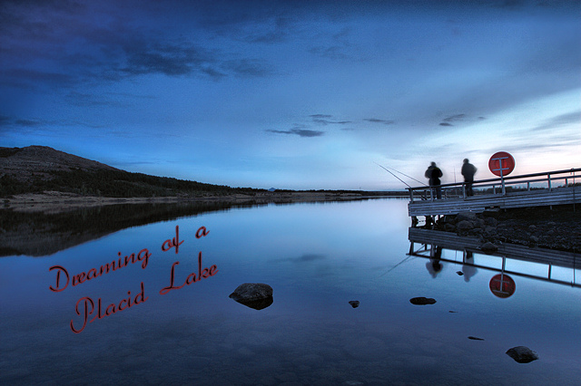
Camera Work/Technical: Very nice, strong image with some great near-silhouettes. I like your coloring, but that 13 seconds produced some pretty strong ghosting.
Lighting: Overall, the lighting looks a little flat. I guess that it was pretty dark out there, huh? I think a little curves adjustment would have helped out your lighting a bit.
Composition/Content: Your test placement is a bit awkward, but I really like your composition. You have leading lines all over that work to draw the eye in and around the entire image.
My Opinion: This is definitely a stronger image that the score reflected. With better text placement and a little more contrast, I think that this would have scored much better. Even with it as it is, 5.2 is far too low. Darn voters.
Thank you for the opportunity to provide a critique on your entry,
Eric
|






 Add photograph to your favorites
 Add photographer to your favorites

 Photographer found comment helpful.


