CRITIQUE CLUB CRITIQUE
by karmat
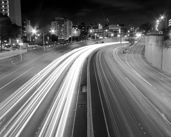
compositionally, this is a very strong image. I like how the "lines" start at the bottom of the frame and lead up and into it. The curve also gives the photo a nice shape. It feels symmetrical, without being perfectly symmetrical.
Technically, it is also fairly well done. The focus is okay, though I think if the buildings were a bit sharper, the overall image would have been stronger. Finally, I think the contrast needs to be boosted just a hair. The "whites" are good, but the rest seems kinda flat and gray.
Good work, and best to you in future challenges.
Karma |






 Add photograph to your favorites
 Add photographer to your favorites

 Photographer found comment helpful.


