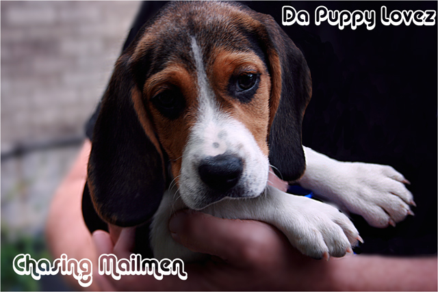
I love the font - great choice of style and size. The puppy is also very cute.
I'd slightly reposition the logo in the upper right corner. It's a little too close to the top and right hand edges. I'd also like to see a little more detail drawn out of the shadow on the puppies left eye.
Lack of lighting on the left side of the dog's face has hidden some of the detail, and the composition also seems a bit off. Maybe you could have used a reflector to bring out more of the left side of the dog's face?
The only thing that instantly caught my eye is that the space between the text and the frame is uneven. Da Puppy Lovez probably shouldn't be that close to the frame.
Otherwise, it's a nice shot and really does well.





 Add photograph to your favorites
 Add photographer to your favorites


 Photographer found comment helpful.


