| Author | Thread |
Comments Made During the Challenge  |
|
|
12/21/2003 11:16:39 PM |
|
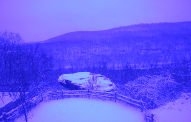
I don't personally care for the unatural purple colors in this shot, would have been better in its natural coloring I feel. |
|
|
|
12/21/2003 11:15:20 AM |
|
I dont like the blue at all, and I dont see any water. 1 |
|
|
|
12/20/2003 02:29:29 PM |
|
Colors are terrible. Can't really tell what I'm looking at because the details are so distorted by the color. |
|
|
|
12/19/2003 09:11:31 PM |
I'm sorry to have to state the bleedin' obvious but this is too blue for me. The effect of colour seems to have replaced a strong subject.
I see snow, and therefore water, but the scene is too indistinct and uninteresting. It lacks a focal point, so getting low down with some branches or foreground in the frame would help to add dimension. |
|
|
|
12/19/2003 10:08:43 AM |
|
Colors seem too dark...really does not seem to emphasize snow. |
|
|
|
12/19/2003 01:50:36 AM |
|
Hmm, the white balance is off a bit. Could use a stronger focus as well. I'm not sure what the focal point of this image is...As landscapes go, I think it could be done better. |
|
|
|
12/18/2003 10:44:44 PM |
|
I really don't care for the effect here. Looks like it may have been a nice photo without it. |
|
|
|
12/18/2003 08:49:20 PM |
|
Not sure if this is intentional, but it is not very pleasing to the eye. Hard to make out details at all. |
|
|
|
12/18/2003 07:55:20 AM |
|
Were you shooting through a tinted window? This looks like the result of what happens when film gets too old. The overall image quality is not very good; there may be interest in the scene, but it's hard to make out. Sorry.... :-( |
|
|
|
12/15/2003 10:32:23 PM |
|
To bad about the blue tint, not a good choice for this shot. |
|
|
|
12/15/2003 01:42:42 PM |
|
Not sure why you toned it this way... I'm afraid it doesn't add a lot to the image. |
|
|
|
12/15/2003 01:02:15 PM |
|
i don't understand the purpose or intent of the color here. |
|
|
|
12/15/2003 10:49:38 AM |
|
beautiful photograph, but I'm not so sure I like all the color added to it.....I'm not trying to be critical because I think the composition of the photo and the subject is wonderful. The color just does not appeal to my eye. I am giving it a higher score tho... |
|
|
|
12/15/2003 07:18:59 AM |
|
The photo is too purple-bluey for me and it mostly looks like a winter landscape. I am not sure I would associate to the water / snow here, anyway, it's on the photo, but I would like to see a more effective way that brings it out. |
|
|
|
12/15/2003 03:33:15 AM |
|
Sorry, but the purple really doesn;t work for me. |
|
|
|
12/15/2003 12:08:26 AM |
|
the bluing effect is highly distracting, possibly b/w would have worked well on this shot |
|
Home -
Challenges -
Community -
League -
Photos -
Cameras -
Lenses -
Learn -
Help -
Terms of Use -
Privacy -
Top ^
DPChallenge, and website content and design, Copyright © 2001-2026 Challenging Technologies, LLC.
All digital photo copyrights belong to the photographers and may not be used without permission.
Current Server Time: 06/27/2026 08:09:17 PM EDT.