| Author | Thread |
|
|
05/20/2007 08:24:14 PM |
|
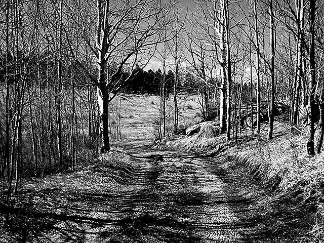
I think the contrast and sharpness make it really interesting. |
|
 Photographer found comment helpful. Photographer found comment helpful. |
|
|
05/03/2007 09:30:18 AM |
|
I was excited to see the thumb of this, I was thinking, ooooooOOOoo a spooky trail or something. However, looking at it larger, it seems like an image from an old newspaper. Almost seems overly sharp. Not really exactly know what I feel about this image. Most times the style of this is enjoyable, but here, I just find myself lacking the enjoy part.... don't get me wrong its a good image, just think I was expecting something else. |
|
| Photographer found comment helpful. |
|
|
05/02/2007 07:55:39 AM |
|
I was thinking about this for a bit and was not sure if I liked the extra sharpness or not. And lol, I think I do because what it really does is helps define each tree. I think the trees could have gotten lost and blended together in the B/W. Interesting pic! |
|
| Photographer found comment helpful. |
|
|
05/02/2007 02:10:59 AM |
|
I think the sharpness of the post processing makes it a bit too busy. Love the tones though. |
|
| Photographer found comment helpful. |
|
|
05/02/2007 12:19:04 AM |
|
It's very black and white. |
|
| Photographer found comment helpful. |
|
|
05/01/2007 09:26:23 PM |
|
Terrific high contrast. Almost like a pen and ink. I dig it. Welcome!!! |
|
| Photographer found comment helpful. |
|
|
05/01/2007 08:46:27 PM |
|
the high contrast processing works pretty well (especially on the light on the trees) but I almost would like a little less contrast on the path - it seems to get a little lost in the shadows. |
|
| Photographer found comment helpful. |
|
|
05/01/2007 07:56:32 PM |
This is really so differant from the normal, and I personally really like it.
It almost looks like an etching......
Tops IMO, and also I love the leading lines and perspective, that you have captures..... |
|
| Photographer found comment helpful. |
|
|
05/01/2007 07:04:37 PM |
|
wow...I lkove this. I am a genealogy hobbiest and this seems to be from way back in time. |
|
| Photographer found comment helpful. |
|
|
05/01/2007 06:46:12 PM |
|
Nice shot. Agree with comments that it's a little too much sharpen and contrast for my tastes, but the effect you have achieved is well executed and a different take on this type of scene. |
|
| Photographer found comment helpful. |
|
|
05/01/2007 03:46:34 PM |
excellent scene .. i'm feeling that your contrast is just a tiney bit too much & it does look a bit oversharpened to me ... ... and that's only my opinion .. this is obviously the look you were going for and it will work very well for many ppl ...
glad someone helped you work out how to put this in here ... that's just one of the things i love about dpc ... the ppl are great ... |
|
| Photographer found comment helpful. |
|
|
05/01/2007 02:51:14 PM |
|
Chunky sharpen lends this pathway/trail a old-time magazine, big, screen dot pattern or sometimes a pen & ink - the effect for me is always graphic. |
|
| Photographer found comment helpful. |
|
|
05/01/2007 02:21:05 PM |
|
this looks interesting. i like the composition and the perspective, but looks a bit high contrast and sharp on my screen. |
|
| Photographer found comment helpful. |
|
|
05/01/2007 02:02:36 PM |
|
I tend to like to play with the effects, glad you do too. Nice job. Congrats on getting the shot up and running too! Welcome. |
|
| Photographer found comment helpful. |
|
|
05/01/2007 01:50:53 PM |
|
I really like the perspective but I find it too contrasty. |
|
| Photographer found comment helpful. |
|
|
05/01/2007 01:46:21 PM |
I'm glad you got it up, Rosemary! I do like high contrasty landscapes, and the dirt path leads your eye to the open field making it very interesting. You certainly got the "true blacks" and "true whites" that make black & white photos pop.
|
|
| Photographer found comment helpful. |
|
|
05/01/2007 01:42:54 PM |
|
A wee bit too much contrast for /my personal taste, sure it adds POP to the image but /this image is naturally sharp and /could do with a bit of toning down IMHO, don't get me wrong, it's a cracking photo. |
|
| Photographer found comment helpful. |
|
|
05/01/2007 01:24:02 PM |
|
The editing here gives this a very eerie feeling. I really like it. |
|
| Photographer found comment helpful. |
|
|
05/01/2007 01:11:24 PM |
Ya know, not enough credit is given to the editing software and what we can do with it. The style for these challenges seems to be one that is very recognizable as opposed to really being able to be somewhat "abstract".
I love the idea that you've added noise to this and almost "posterized" it. I think we need to keep seeing more of what can be done with the editing software! I really like this. |
|
| Photographer found comment helpful. |
Home -
Challenges -
Community -
League -
Photos -
Cameras -
Lenses -
Learn -
Help -
Terms of Use -
Privacy -
Top ^
DPChallenge, and website content and design, Copyright © 2001-2026 Challenging Technologies, LLC.
All digital photo copyrights belong to the photographers and may not be used without permission.
Current Server Time: 07/22/2026 06:17:43 AM EDT.