| Author | Thread |
|
|
05/13/2007 11:47:30 PM |
Greetings from the Critique Club!
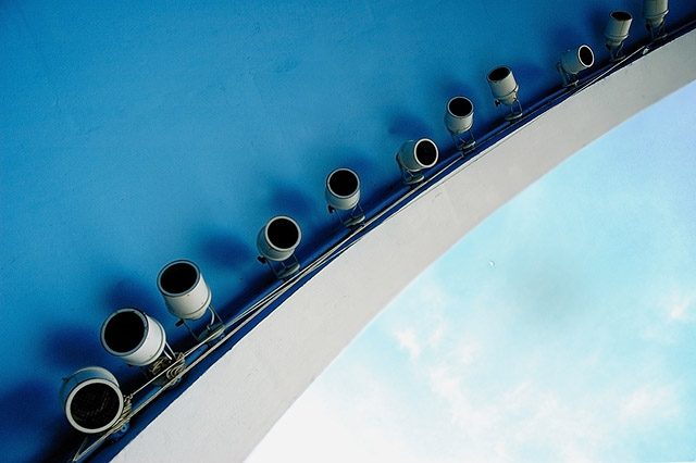
I like the pattern here, and the way the dark blue of the ceiling offsets the paler blue of the sky. The placement of the gray arch and the lights works well here, though I wonder if this might have been a little stronger with just a little of the left side cropped away (closer to the leftmost light).
I like the patters created by the lights, but overall, this photograph says "patterns" or "repetition" to me, more than it says symmetry. I would not go so far as to say this does not meet the challenge, but I wouldn't say that it totally nails the challenge topic either. This may be the largest reason this photograph did not score higher than it did.
Still, this is a quality image that you should be happy with.
~Terry |
|
 Photographer found comment helpful. Photographer found comment helpful. |
Comments Made During the Challenge  |
|
|
05/06/2007 07:47:09 AM |
|
I love the shot. 7 from me. |
|
| Photographer found comment helpful. |
|
|
05/04/2007 06:00:07 PM |
|
Grear tones of blea and gray. - 7 |
|
| Photographer found comment helpful. |
|
|
05/04/2007 01:50:35 AM |
|
I like the picture a lot, though I keep wondering how well it fits the symmetry part of the challenge... -7- |
|
| Photographer found comment helpful. |
|
|
05/03/2007 06:38:13 AM |
|
| Photographer found comment helpful. |
Home -
Challenges -
Community -
League -
Photos -
Cameras -
Lenses -
Learn -
Help -
Terms of Use -
Privacy -
Top ^
DPChallenge, and website content and design, Copyright © 2001-2026 Challenging Technologies, LLC.
All digital photo copyrights belong to the photographers and may not be used without permission.
Current Server Time: 06/28/2026 07:04:36 AM EDT.