| Author | Thread |
|
|
06/07/2008 10:10:16 AM |
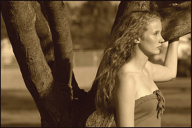
Stunning. Beautiful lady, beautiful environment, great light, and the sepia adds a timelessness that I like.
One tiny nit. I think you could have dried her cheek and forehead a bit. It looks like it might have been hot that day. |
|
 Photographer found comment helpful. Photographer found comment helpful. |
|
|
03/01/2008 10:01:30 AM |
|
I love the tones in this and the light on her face, she is a beautiful girl and you have captured her very well. |
|
| Photographer found comment helpful. |
|
|
10/30/2007 03:27:58 AM |
|
What a beautiful picture . |
|
| Photographer found comment helpful. |
|
|
05/05/2007 09:30:24 AM |
Greetings from the Critique Club!
Hello Marco and welcome to DPC. Congratulations on a lovely image. I think your composition, processing, attention to light and contrast are excellent here. The only unfortunate element is the fence in the background which is not only bright, but cuts the image in the middle horizontally. A touch of darkening would help the fence to be less noticable and not distract from your lovely model.
Good luck with your future entries! :)
Cindi |
|
| Photographer found comment helpful. |
Comments Made During the Challenge  |
|
|
05/01/2007 09:38:05 PM |
|
the sepia tone goes well with the shot |
|
| Photographer found comment helpful. |
|
|
04/30/2007 08:41:45 AM |
|
Pretty nice, a bit flat contrast wise for my taste but good enough for a 6 from me. |
|
| Photographer found comment helpful. |
|
|
04/28/2007 03:11:10 PM |
|
i think this has the potential to be excellent, but i am uncomfortable with the model looking *out* of the frame; it would feel much more balanced if she were at the left-hand third (still looking to the right)..... |
|
| Photographer found comment helpful. |
|
|
04/28/2007 10:55:12 AM |
|
| Photographer found comment helpful. |
|
|
04/27/2007 10:18:08 PM |
|
Interesting choice with your model gazing out of the frame. Makes her seem very aloof. |
|
| Photographer found comment helpful. |
|
|
04/26/2007 04:15:01 PM |
|
I like this photo, would have liked it more if Courtney was looking into the photo rather than out of it....7 |
|
| Photographer found comment helpful. |
|
|
04/26/2007 11:03:05 AM |
|
I feel as if she's facin g the wrong way, but then that's the filmmaker in me talking. Otherwise gorgeous shot with great sepia tone. |
|
| Photographer found comment helpful. |
|
|
04/26/2007 09:24:38 AM |
|
| Photographer found comment helpful. |
|
|
04/26/2007 08:01:42 AM |
|
Elegant shot but would benefit quite a bit by a LOT cropped off the left IMO. ... 6 |
|
| Photographer found comment helpful. |
|
|
04/26/2007 03:46:46 AM |
|
IMO i think it might look better if she was looking into the piture rather than into the side of the frame. |
|
| Photographer found comment helpful. |
|
|
04/25/2007 02:16:21 PM |
|
This works very well. You break the rules about flow and not having images looking out of the frame, and all that, but it still works. Nicely done :-) |
|
| Photographer found comment helpful. |
|
|
04/25/2007 08:13:24 AM |
|
while I like the image overall...I think the model should have been on the left looking into the right space rather than this way around. like this, the branches are a real focal point that is distracting as is the 'fence' in the background...also, the particular sepia you used is not really flattering. She is quite pretty...I don't want to be negative, but a little more compositional thought would have bought out her beauty more. On the positive, I like her pose and the look of the breeze in her hair... |
|
| Photographer found comment helpful. |
|
|
04/25/2007 01:17:54 AM |
|
Great lighting but the fence in the background is a little distracting. |
|
| Photographer found comment helpful. |
|
|
04/25/2007 12:53:40 AM |
|
I like the tones, but it needs a tad more contrast for my tastes...compositionally, she should be facing the other way looking through the frame, not out of it... |
|
| Photographer found comment helpful. |
Home -
Challenges -
Community -
League -
Photos -
Cameras -
Lenses -
Learn -
Help -
Terms of Use -
Privacy -
Top ^
DPChallenge, and website content and design, Copyright © 2001-2026 Challenging Technologies, LLC.
All digital photo copyrights belong to the photographers and may not be used without permission.
Current Server Time: 07/06/2026 01:38:07 AM EDT.