| Author | Thread |
|
|
12/18/2003 04:23:52 AM |
Critique Club intervention coming up:
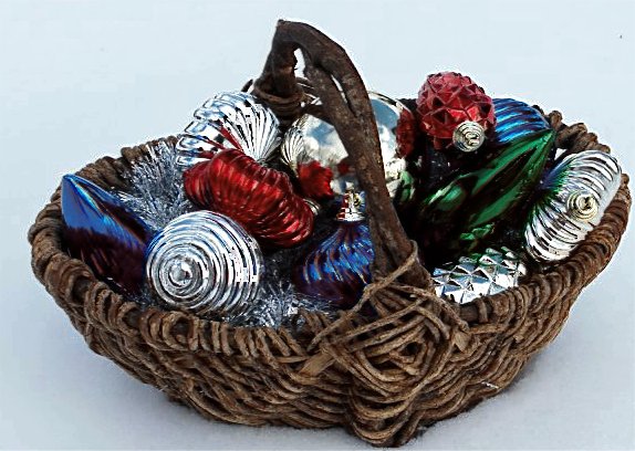
Shapes galore in this composition, many of them would, alone, have been a fine candidate for this challenge.
The basket is the one object that really stands out. The Christmas decorations would stand out better if the background were much darker. Mixing highly reflective objects with others always creates insoluble lighting problems.
I just noticed the background must be snow, too bad the grain of it is not more perceptible; this would change the feel of this image a lot. The dull white setting really contrast violently with your festive accessories, gives it static look and fails to contextually enhance the subject. Perhaps unevenly sinking this basket in the snow would have given a better sense of where it was. Shooting in a warmer “living room“ kind of environment would also contribute to help people relate emotionally to this kind of shot.
Technically it seems that the composition’s focus was not spot on and then was over-sharpened a bit.
Hope this helps,
All the best, JJ
|
|
Comments Made During the Challenge  |
|
|
12/14/2003 09:07:53 PM |
|
Nice shapes, and Well chosen background-- putting the basket on the snow |
|
 Photographer found comment helpful. Photographer found comment helpful. |
|
|
12/13/2003 04:50:50 PM |
|
|
|
12/11/2003 05:22:57 PM |
|
Interesting. The fact that you took this in the snow is a neat idea. However, you need just a bit more lighting on the snow to bring that fact out. Possibly a flashlight lying on top of the snow facing the basket? I like the colours on the trimmings, very vidid. I wish colour of the basket was a bit more so. The composition leaves some to be desired. It feels static and boxed in. |
|
| Photographer found comment helpful. |
|
|
12/09/2003 11:18:19 PM |
|
| Photographer found comment helpful. |
|
|
12/09/2003 03:30:16 PM |
|
Not a bad shot, but it could be better. While numerous shapes are present it just doesn't shout shape to me. The crop is too tight which makes it feel cramped. Maybe a closer more dramatic angle would be better, or more negative space with basket placement following the rule of thirds. |
|
|
|
12/09/2003 12:30:47 AM |
Nice idea but looks a little out of focus and busy
I do like it though |
|
| Photographer found comment helpful. |
|
|
12/08/2003 11:37:26 PM |
|
You got many shapes, but they don't really make the image any better. You could have picked one of the ornaments and explore that in more depth. Simplify. The colours are nice, but your photo is a bit pixelated. The snow looks greish blue (if that's a snow). Also the crop is a bit too tight. Give your object more breathing space. |
|
|
|
12/08/2003 06:36:25 PM |
|
shape not really most important aspect |
|
|
|
12/08/2003 09:54:21 AM |
Cropped too tightly. Slightly oversharpened.
Nice holiday theme! |
|
Home -
Challenges -
Community -
League -
Photos -
Cameras -
Lenses -
Learn -
Help -
Terms of Use -
Privacy -
Top ^
DPChallenge, and website content and design, Copyright © 2001-2026 Challenging Technologies, LLC.
All digital photo copyrights belong to the photographers and may not be used without permission.
Current Server Time: 06/29/2026 05:07:20 AM EDT.