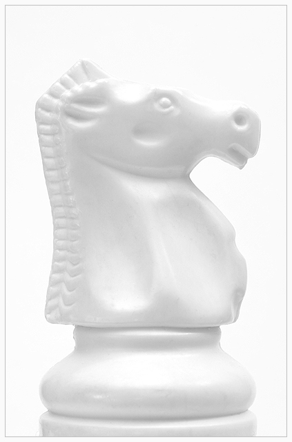
Nice shot Setz! As usual a more artistic shot like this gets scored lowely, nonetheless I like it, alot. You again astound me with your lighting techniques, keep it up. Your always an inspiration to me, and I will constantly be asking questions!
Nice study in whites. You have gotten a nice sculpted look with minimal range. The effect definitely emphasizes shape. Spot on the top between ear and eye is so bright, I can bearly see a separatrion between the knight and the white background (if at all) Just a slight adjustment in lighting or exposure would righ that. I'd like to see another pic done of a black knight on a black background and matte the two together (after the competition naturally!) 8
The idea is good but due to the exposure (slightly overexposed) and the white knight on a white background, I think it tend to make the shape disapear. Instead of being the main element of the shot it seems like it's the only thing that we are not able to see like we want. (6)
I like the concept of this shot, especially the "white on white" aspect of presenting shape. However, I find that the composition is not dynamic enough to be visually engaging for very long. I think that having another chess piece in the shot to create some visual tension would create more interest, and for my taste, would make a more powerful shot.
This may have been more appealing and less "stark" if black had been your chosen background color. Perhaps the starkness is what you where looking for but the white on white really does not help define the edges of your subject which I personally think would have helped this be a stronger competitor in the Shapes challenge.
Beats the heck out of me how you got so much detail in your chess piece with the background and the subject being the same color, but you did it, this is outstanding, the detail shows up perfectly







 Add photograph to your favorites
 Add photographer to your favorites


