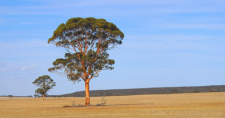
This is my Uncle's farm in Kununoppin. Country I just love.
Converted from ARW to TIF, changed to 8 bits from 16, noise ninja, increased saturation, resized with several step downs, noise ninja twice, unsharp mask twice, first at 50% 0.9 0 then 30% 0.6 0, Curved to brighten a bit, saved for web.
Post Voting
HOT DAMN!!!! NEW PB!
Thanks everyone!
Statistics
Place: 147 out of 308 Avg (all users): 5.7082 Avg (commenters): 6.5000 Avg (participants): 5.5618 Avg (non-participants): 5.7857 Views since voting: 1154 Views during voting: 371 Votes: 257 Comments: 13 Favorites: 1 (view)
I really like the wide ratio for this landscape and I also like the minimalist approach. I think a couple of things that would have made it stronger would have been a little more saturation of the yellows and also the horizon seems a tad bit off of straight. Other than that it is a very pleasing shot to look at.
Positives: Image has an almost minimalist feeling to it that well conveys the openess of the country. Technicals generally good.
Technicals: Good use of the rule of thirds. Ground color is especially good and the sharpness and detail in the trees is excellent. There is faint haloing along the horizon edge and in the trees. The sky color looks a bit artificial blue, probably from oversaturating the blue in post processing. This is evidenced by the fact that the clouds are not pure white, but have a blue color cast. The sky is rather 'flat' appearing. The image MIGHT be tilted slightly counterclockwise to the horizon.
The Challenge: Meets the challenge, no question. There is not a lot of interest for the viewer to look at in the sky and that likely affected it in voting. Also, since this was an 'expert' editing challenge voters were probably looking for even more pizzaz in the images than they usually expect.
Suggestions: The sky is the biggest issue. You might want to convert if from RAW again and this time work on the blues in the RAW image processor for whiter clouds and perhaps add more contrast to the sky to bring out stronger detail. A trick you can do to add interest to it is to add a blue gradient layer masked for sky only and adjusted correct just down to the horizon.
If the horizon is not truly level it is really close, but you might want to rotate the image a degree or so clockwise to see how that looks. If nothing else you will be surprised how big a difference in the appearance of the image a slight rotation makes. Might not need it, though.
The first landscape I like in this challenge :)
Maybe the composition would be better if the trees were in the right side of the frame and not in the left.





 Add photograph to your favorites
 Add photographer to your favorites

 Photographer found comment helpful.


