Well, here's my two cents. :)
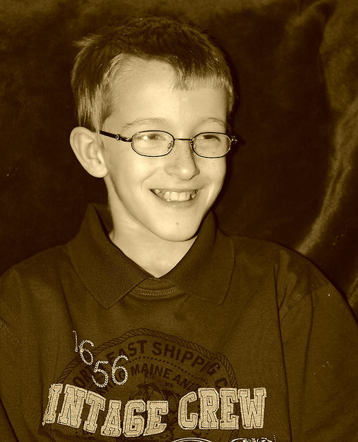
I like the sepia, but it almost feels a little bit green - I have that problem to, but I've found that desaturating a littl bit usually helps that. And then I might also suggest cropping a little more. He does have a great smile, but the writting on the shirt kind of distracts the viewer away from that a little. Otherwise, it's a great shot!
Is this a duotone? Or a black and white with color added? I think it's a poor color choice, especially for his skin. The focus is nice and sharp, and the expression is a nice capture - maybe crop it tighter to his face.
The wrinkled fabric in the background is a little distracting to me. I think flattening the fabric, blackening the background, and perhaps going to true black and white would improve the image.
Right then, joke's on me as I now have to plough through 564 images and bump them all (yes, all of them) up. There'll be a third run through for fine tuning. It's day two now and I'm running late, sorry.







 Add photograph to your favorites
 Add photographer to your favorites


 Photographer found comment helpful.


