Sorry about the empty comment below. I was figuring out how to get the thumbnail in here when that happened.
Editing as well as I can remember:
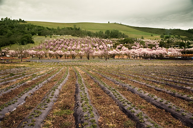
Open in Raw
Made some changes in Raw, but didn't write them down...:>(
Levels to set black and white points
Background copy>Multiply to darken sky
Selected foreground>color balance to enhance reds
Selected sky>Levels to darken
Selected foreground>layer to brighten
Selected hills>color balance to enhance green
Selected trees>color balance to enhance reds
Dodge/Burn layer for vignette
Select white house>Brightness layer to darken
Resize
Select from trees up>USM 100, 1.0 radius, threshold 1
Select from trees down> USM 50, .5 radius, threshold 1
Save for Web
You've asked for "critical" comments, so I'm trying to be very nit-picky here. This is very, very well processed, especially considering the lighting in the original image. Such a difference in shades of color and light, with great effect on the whole. The lines still work well, and I pick them up more now, even moving through the trees (which are also nicely aligned), and which I didn't get from the original. I'm still left wondering if a more panoramic shot would work better, cropped longer and shorter (the foreground seems a little extensive for me, and if you cut it a bit, it might actually draw the image within the rule of thirds: bottom third planted rows; middle third trees and hills; top third sky -- but that might not work out). That's all I can think of, and it really is picky stuff! Nicely done.
Great job bringing out the warmth of the natural colors. Very good work using selections and handling those as needed - something I need to work on. The only thing I can see that I might change is the dark area of the sky in the upper left - it's naturally there (it's in the original) but it is a bit distracting because it's such a small area. The section on the right is fine.
i really like how you've given the image more contrast and depth ... i personally liked that little bit of smoke rhs which i would've kept or enhanced .. anything i say would only be my personal opinion and i cant say enough, that other ppl have different ideas that are just as valid ... i actually liked the original colour hue .. i'm not that keen on the pink look ... feel a bit uncomfortable saying that .. but you did ask for opinions!... i'm now trying to see it as if i'm someone else, and i think that a lot of ppl would like the pink ...
but wotever ... its an excellent photograph ...
re the getting it right for internet viewing ... if you look at other ppls work in dpc, especially the winners!!! .. then maybe you can calibrate your monitor so that your own images sort of match them ...
also i was saying in my perspective/edited comments that i have trouble getting the colours right ... like i get image saved for web and download into dpc and it looks quite different ...
deb Melethia wrote ... As for colors being different on DPC, if you shoot in RAW, you need to "convert to profile" to sRGB from the native format. This will make the colors appropriate for the web. It's an option in Photoshop under "Edit". i did try wot she said but couldnt see a difference, altho i now realise that i didnt actually download the one i tried in dpc, i just looked at it on my screen .... dohhh .. also i couldnt find the exact sRGB that she mentioned in "convert to profile".. i'm thinking i'll google RAW and try and work it out for myself ... unless someone can tell us from reading this ... etc ..
edit .. just had another look and i think i'd have increased the saturation in the red and the green to create a contrast with the colouring ... to bring out the red of the earth and the green of the vegetation .. ?? .. and i dont even know if i should make these sort of suggestions, because without getting it into photoshop and actually making the changes, i find it difficult to visualize the outcome ...