| Author | Thread |
|
|
03/19/2007 02:13:21 PM |
|
nice the detail is wonderful it really pops. |
|
 Photographer found comment helpful. Photographer found comment helpful. |
|
|
03/18/2007 06:03:54 PM |
|
This was a good shot to begin with, but the editing has really brought out all of its good elements. (I refuse to "say" the word "pop".) I'm glad you left the legs -- they add the quirky grace note. |
|
| Photographer found comment helpful. |
|
|
03/18/2007 10:50:42 AM |
|
You made a gem from a rough stone with this one. I need to learn about layering in order to present some of my images in better fashion. I like images with geometric shapes, and this one is full. |
|
| Photographer found comment helpful. |
|
|
03/17/2007 07:18:22 PM |
|
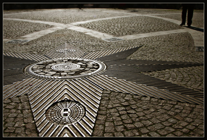
Interesting - I did not think this was a color photo. An optical illusion of sorts. I like the mixture of textures a lot, as I did in the original, and I think the feet are an important component for adding scale and context - so I'm glad you didn't remove them. The brights look a little too bright on my monitor and trap my eyes in the star area - but it may just be my monitor. The one thing I would consider, aside from dimming the brights just a notch, would be to clone out the two shadows or cracks toward the very back that break the line of the arc. I think they detract from the continuity. BTW - I did notice you straightened this - and am glad, as it looked slightly skewed to left before. |
|
| Photographer found comment helpful. |
|
|
03/17/2007 04:30:18 PM |
excellent result with your editing deb ... the different hue really works .. i must'v missed the unedited version when you posted it ... i love the different patterns & i really like the composition with the off centre star .. the refected light is great ..
Message edited by author 2007-03-17 16:30:42. |
|
| Photographer found comment helpful. |
|
|
03/17/2007 03:45:06 PM |
|
Great photo, the color is great, and goes with the theme well. The patterns are also pleaseing. Overall awsome! |
|
| Photographer found comment helpful. |
Home -
Challenges -
Community -
League -
Photos -
Cameras -
Lenses -
Learn -
Help -
Terms of Use -
Privacy -
Top ^
DPChallenge, and website content and design, Copyright © 2001-2026 Challenging Technologies, LLC.
All digital photo copyrights belong to the photographers and may not be used without permission.
Current Server Time: 06/30/2026 08:45:12 AM EDT.