Author Thread Comments Made During the Challenge
Post actions
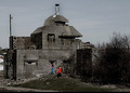
Great idea-but those wires really take away from the photo-this still does not deserve a score of less than 4. Great clarity and colors
Post actions
Clock tower is very interesting but power lines are very distracting
Post actions
Post actions
I like the contrast between the buildings. Too bad about the cables. 7
Post actions
the building in the back adds to it... however, powerlines take away
Post actions
I like grey+blue color combination, but the clock does not standout as an important part of the image - looks flat.
Post actions
I like the triangular shadow but not the pole/wires
Post actions
Post actions
Wires does not add to the picture ...6
Post actions
Like the clock and modern background building. The out-of-focus post and wiring acts as a distraction.
Post actions
I would give this a few points more if the wires weren't there. I would have tried to take it from a different angle to get rid of the wires. It's a great contrast of old and new.







 Add photograph to your favorites
 Add photographer to your favorites


 Photographer found comment helpful.


