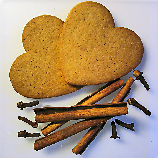
I like the layout and placement of the cookies and things. This is a very nice photo. I do see some neon-blue color around the right of the cinnamon sticks and cloves (?) that doesn't seem to belong, though. The upper left of the photo seems perfectly lit but as you go down and to the right it worsens. It gets darker and darker and the blue colors show up more.
Nice. Did you use sunlight and incandascent lights? I think I would like it better without the blue overcast. You could maybe correct it by adjusting your color balance in your editing program and desaturating the blue and cyan channels a bit.
Not a bad picture but somehow the warm colors of the subject clash with the cold color of the background. There is also a noticeable halos as a result of oversharpening.
Is that plexiglass? It's a cute idea and the composition is good. The white marks/reflections are a little distracting but not overly so. I'm not sure if it needs a tad more sharpness or contrast. The bright light from the top right makes the background a little uneven and forces some shadows that are a little noisy. An additional light in the bottom right may have helped a little.






 Add photograph to your favorites
 Add photographer to your favorites


 Photographer found comment helpful.


