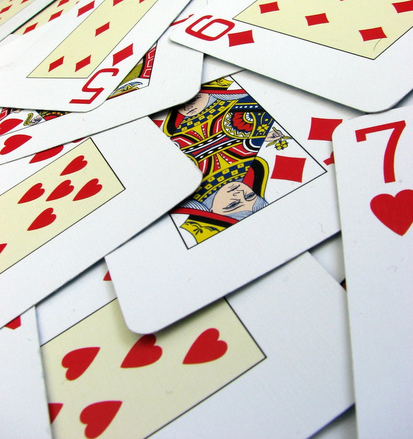
I took quite a few shots of playing cards, but this was the one I ended up going with. I like the fact that the contrast makes it almost harsh and draws the eye to the reds
Editing involved resizing, a slight crop and adjusting the contrast levels on Picasa2 (Thanks to the DPers who told me about this)
Statistics
Place: 145 out of 434 Avg (all users): 5.4510 Avg (commenters): 6.8000 Avg (participants): 5.1560 Avg (non-participants): 5.7895 Views since voting: 967 Views during voting: 255 Votes: 204 Comments: 7 Favorites: 0
Positives:
Generally well done technicals and meets the challenge topic.
Technicals:
Sharpness generally good. Decent perspective and nothing bad about the composition.
The challenge:
No question this meets the challenge in an unmistakable way. It is a bit on the 'cliche'ish side for some voters and might lack a lot of punch and pizzaz that voters are always look for. :)
Suggestions:
There really is a not a lot wrong with this image but not a lot to attract viewer interest either so my suggestions might not have much effect on its score. The center of focus is the center of the image. You might have chosen to focus closer to the foreground than the center but allowed the center to still be within its DOF. Generally speaking, it is better to have the foregound sharply focused and the background softer focused then the other way around like this image.
I normally don't use or recommend borders, but this image might benefit from a modest black border.
I like how the cards fan further apart on a diagonal from the top left to the bottom right. I wish the queen was the only face card and it was the only diamond suit. Good DOF. Very hard to achieve on a slant like this. It was hard choosing between the three suggested numbers. But luv always wins out.







 Add photograph to your favorites
 Add photographer to your favorites

 Photographer found comment helpful.


