- crop
- Reduce Noise with PS Elements "reduce noise"
- resize
- Bright/Cont adjustment layer
- Increase brightness and contrast
- Drop to 80% opacity
- Flatten Image
- USM
- Save for Web
Statistics
Place: 88 out of 359 Avg (all users): 5.6576 Avg (commenters): 6.0000 Avg (participants): 5.3600 Avg (non-participants): 5.8624 Views since voting: 1035 Views during voting: 245 Votes: 184 Comments: 15 Favorites: 0
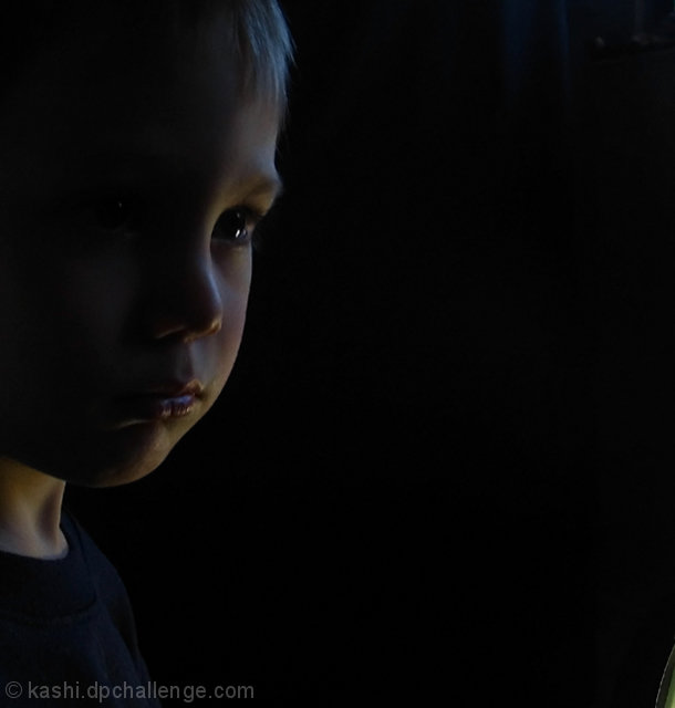
Well, I like this -- I think the lighting is fine and the crop/negative space composition work well.
I wonder if the purplish tone to the highlights disturbed some people as perhaps being a bit out of place -- suitable for an actor or musician on stage, but a little odd for a children's portrait studio.
I'm interested in trying out the step "reduce to 80% opacity" -- above what color BG did you have this as a layer?
I didn't vote in this challenge, but this is a very good photo. Your lighting is perfect. Completely darkening the profile closest to the camera and only lighting the far side of his face. You have a great catchlight in his eye. Had I voted you would have gotten a 7 from me.
Nice soft light to gently outline the contours of the face. In my opinion, it could have been a little brighter though it probably would have lowered your score in this particular challenge. I'm not a good judge of low key, it seems.
Nice use of negative space and has a good feel to it. The biggest problem is the low key is accomplished by what appears to be greatly reduced contrast. You will see the best Low Key shots actually had some true whites in the image. Most successful ones also converted to B&W.
Lea, I didn't vote in this challenge, and with the exception of whatever is showing on the bottom right hand corner, you framed this picture very well. I would have scored this image very high - yet I can't believe this is why it didn't score higher than it did. This should have scored so much higher in my opinion. The mood and expression in the young boy's face is precious - while at the same time so sad. Great job!
I like the composition of the shot ... my favorite part is the great catch light in his eye ... whatever is in the lower right corner is a bit distracting ... I also think that it's slightly under exposed ... I wish that the highlights were a bit brighter ... overall, it's well done and I gave you a 7 during the challenge ...
Very nice. Now that the challenge is over with the basic rules restrictions, you can get rid of that little green distraction in the lower right. You'll have a wonderful moody portrait.
Hi Kashi! Yes, definitely low light usage going on here. Not sure about the element in the bottom right corner, though I do like the slight touch in the top right corner (curtain/window?). Cute expression and a nice side profile.





 Add photograph to your favorites
 Add photographer to your favorites

 Photographer found comment helpful.


