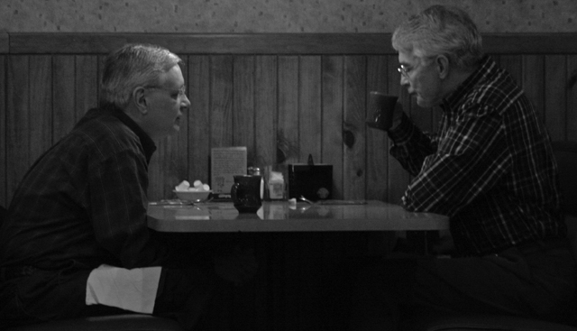
American Association of Retired Persons. I hope this comes across. I know it's dark, but every time I tried to alter it, it got grainier. I didn't want to use flash because I was trying not to disturb the gentlemen.
Statistics
Place: 176 out of 201 Avg (all users): 4.7347 Avg (commenters): 5.0000 Avg (participants): 4.4638 Avg (non-participants): 4.9744 Views since voting: 952 Views during voting: 230 Votes: 147 Comments: 11 Favorites: 0
i dont think this is too dark at all. the darkness of it suits the image real well, it looks like theyre talking about something secret, or real important
A very good idea - and looks like the kind of place that people may associate AARP-aged individuals with. A bit dark and lacking in contrast to do justice to your subjects. The thing that draws my eye most is the napkin on the one gentleman's lap.
Very clever interpretation. I like the idea, but something leaves me wanting more. Maybe if the men were sharper. The guy on my left seems ok, but the one on the right a little soft. Also the shadows are a little too dark for me (specifically under the table). 6






 Add photograph to your favorites
 Add photographer to your favorites

 Photographer found comment helpful.


