| Author | Thread |
|
|
10/30/2007 03:25:33 PM |
|
wow, now this is really art... |
|
|
|
03/01/2007 12:59:19 PM |
*** CRITIQUE CLUB COMMENT ***
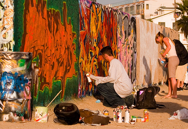
From my perspective, what we have here is an interesting subject captured in about as mundane a manner as could be imagined. The light is very flat, the composition is not dynamic at all, and the whole image is entirely dependent on the graffiti itself for its impact. Although there are figures (artists) in the scene, they are strangely secondary to the image.
Some thoughts for you:
1. Where you are standing, the light's pretty much coming from directly behind you. This is usually the kiss of death for an image. Imagine if you'd gone tot he OTHER side of the kneeling figure, so you were shooting across the light and his shape was strongly modeled or even backlit a little, in semi-silhouette. Do this, maybe move in to such a position that the figure dominates one side of the image, and actually get a shot where you can see the paint (backlit) coming from the nozzle of the can... That's just one possibility. You need to get us involved in the image.
2. As a very general rule, "street photography" works better if we can see faces. Admittedly, that's a problem when they are inches from a wall, but some sort of closer connection tot he artists might help here.
3. You have a color-balance problem, with the whole image coming across too yellow/orange. It's a subtle shift, but an annoying one.
It's difficult to work off such a small image, but here's an example of a more dynamic crop and a better-balanced color, at least IMO: the edge vignetting, however, would not be legal in basic editing.

Hope this has been useful to you.
Robt. |
|
 Photographer found comment helpful. Photographer found comment helpful. |
Comments Made During the Challenge  |
|
|
02/25/2007 11:06:19 AM |
|
too orangy....flesh tones don't look right. |
|
| Photographer found comment helpful. |
|
|
02/24/2007 12:58:32 PM |
|
| Photographer found comment helpful. |
|
|
02/24/2007 06:52:42 AM |
|
As in Venice, California versus Venice, Italy? |
|
|
|
02/21/2007 01:34:42 PM |
|
since graffi seems completely atypical of venice, i wish you found a way to juxtapose some of the more common venitian themes with this wall. obviously that would of required stepping back and loosing some details, but it would remove the strong need of your title to make this shot intriguing at all. |
|
|
|
02/19/2007 10:36:45 PM |
|
| Photographer found comment helpful. |
|
|
02/19/2007 07:33:27 PM |
|
nice color. maybe if the people in the background were cropped out |
|
| Photographer found comment helpful. |
|
|
02/19/2007 07:04:36 PM |
|
|
|
02/19/2007 02:03:49 PM |
|
I think I might have made a tighter crop on the male while still keeping as much color as possible. The other people to the right are slightly distracting. |
|
| Photographer found comment helpful. |
Home -
Challenges -
Community -
League -
Photos -
Cameras -
Lenses -
Learn -
Help -
Terms of Use -
Privacy -
Top ^
DPChallenge, and website content and design, Copyright © 2001-2026 Challenging Technologies, LLC.
All digital photo copyrights belong to the photographers and may not be used without permission.
Current Server Time: 06/29/2026 01:16:49 PM EDT.