today my computer has really stuffed up ... graphics card or possibly driver problems .. things that looked crisp , sharp and colourful, now look dull and lifeless ... i compare my photos with other dpc work to get a sort of standard to go by, but i'm finding it confusing ...
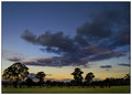
this photo is taken looking down my road ... i was going to put it in unedited then computer stuffed up and photograph totally changed!! ... so i've done some curves, levels .. and a bit of a vignette to fixed up my constant problem of the burned out sky ...
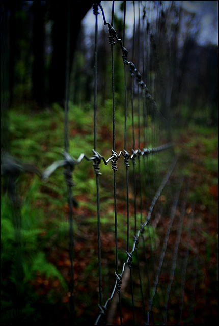
4-02-07 .. my computer is ok for the moment until upgrade in a couple of days .. i've fixed up the darkness to make image how i wanted it in the first place ... this is it ..
The re-edit is maybe a bit better (for darkness), but the original also has its merits; very shallow DoF can work well (I did it on my fences entry), but you need to have something interesting about the pattern of the fence (which you do here, so the shallow focus works here for me). I like it!
Roz, I really like how the center of the shot is crystal clear. Great job on DOF. I like both versions, I think I prefer your processed one. The colors grab me more.
I like this a lot, Roz. For one, the fencing and the depth of field really give it the feeling that this place is off limits. The darkness that you've added to everything gives it a jungle feel, which is spooky. This kind of reminds me of Lost....
The image seems a bit dark on my monitor. It does make for a different sort of abstract with the extreme shallow dof. Sky is not overexposed at all. It is an interesting image with the muted colors in the background. I would probably do a bit more dodging on the fence, or perhaps use a layer to lighten the image, than overaly the darker one and erase at a transparency of around 60 to start, just to see if you could get more detail on the fence.
What a very cool photo! I too am partial to the processed version. I guess like Skewsme, dpc has conidtioned me too. Those rich colors create such a "mood". I love it! would have made a great shallow depth of field entry.
Hi! I like your processed version. Great mood. The orig is fine, but you know, dpc warping trains me to want sharpy colorful shiny etc. Love the perspective and the dof here, and your pp really makes the fence ominous. If I try to nit pick - there might be a little more texture in the foliage and sky than I want - I don't want them to compete with the fence. Have you tried slapping a little noise reduction on this? (or maybe adding more?) Maybe even a gaussian blur with the fence masked out. That might be interesting. Or I could be completely off my rocker ;-) Anyway, I do like this, and I think it would score really well in a leading lines challenge, especially if you stick a subject at the deep end. Good luck with your computer problems. Maybe it's your monitor?






 Add photograph to your favorites
 Add photographer to your favorites


 Photographer found comment helpful.


