| Author | Thread |
|
|
02/07/2007 04:50:24 PM |
Although I didn't vote on this particular image in the challenge, I would have given it a 5 at best. Yes, it meets the challenge for shallow DOF. The lighting is harsh, the tones are not appealing (too yellowish-greenish to me), the horizon seems a hair tilted, and the image is noisy. The composition is fair, but busy, and the top crop seems a bit tight. The subject matter is commonplace, but can be done well. Hope it's not too harsh, but it's my honest opinion. I think a 5.3 is just about right for its placement in this challenge.
Message edited by author 2007-02-07 16:51:23. |
|
 Photographer found comment helpful. Photographer found comment helpful. |
|
|
02/07/2007 01:55:18 PM |
|
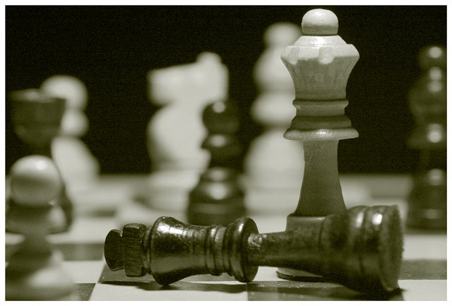
Frame is cropped too closely above the queens head, specular highlights on the king detract. The queen intersects the background OOF element, which draws the eyes away too much. Sharpness of in focus elements is not very good. The background elements are overall more brightly and evenly lit than the queen/king, try a gobo between the oof elements and the light to reduce the spill. soften the light with a thin piece of cloth (sheer silk work great) or a thin piece of tracing paper. |
|
| Photographer found comment helpful. |
|
|
02/07/2007 01:05:30 PM |
|
I gave this a 6. I think it has some really strong points: good shallow DOF; pleasing composition; funny title. Technical issues that kept it from scoring higher IMO: harsh overhead lighting; not enough negative space above queen and below king; noise in shadows; color cast in b&w (almost looks like green or yellow filter was applied). Hope this is helpful! |
|
| Photographer found comment helpful. |
|
|
02/07/2007 01:05:11 PM |
I note that 'technical comments and suggestions' have been made here and left with the image in the meantime.
There are, however, various other observations one could make regarding the context, range and 'feel' of this entry.
The obvious context is a game of chess, less trivial than many other games perhaps, but, as a subject, hardly enough to arouse more than an aesthetic interest. The aesthetics, here (as has already been pointed out), suffer from technical defects significant enough to prevent this sort of pleasant distraction. Chess players, too, have insufficient information to visualize that which the game is about -strategy. All this
reduces the potential 'range' of a shot like this one to near nil, and it does so before being able to attach any real latency, except for the one alluded to by the title. Most viewers, to my sense of it and also as evidenced by several comments, would perceive the title to be a stretch, put up as an addendum or afterthought rather than having any allegorical or symbolic qualities, given the image it is supposed to 'charge'. It rather weakens it, which is unfortunate, considering the meagre premise it presents without the help of a title relating credibly what the image 'is' or, more ambitiously, could be.
A 'good' photograph is one in which the technical aspects are subordinated to its inherent demands. A 'better' photo is one that radiates 'energy'. This capture, IMHO, fails on both counts. It fails auntie Peggy as much as it wouldn't rouse Bobby Fisher. The attempt at a gender-specific humour, too, can all too easily perceived as cliché and lack-luster causing no twitch or distortion of a facial-muscle when associated with a fallen chess piece rendered 'recognizable' at best.
This genre of photograph, IMO (and I swear, I rarely act as a proponent of technical aspects of a picture), would benefit immensely from aesthetic properties created via a discriminating eye for lighting and careful technical treatment during processing. At least, in this way, the lack of 'emotional charge' can be well hidden under a shiny hood.
May I be forgiven for what I have tried, here, to so frankly say. |
|
| Photographer found comment helpful. |
|
|
02/07/2007 12:46:53 PM |
The idea is fun although not very orignal I'm afraid (lots of chessboard pictures around). Furthermore it's a dull chessboard. Would have been better with more original pieces (glass etc.)
There is definitely a good use of DOF, that meets the challenge.
There are some serious technical issues IMHO though:
1/ shade is full a noise, which is really bad
2/ lighting is not good either. Too harsh, and from above. Looks as if it is shot under a ceiling neon of some kind. Try a more lateral, more difuse lighting.
3/ greenish B&W.
Hope I'm not too harsh in my comments, and that it can help. |
|
| Photographer found comment helpful. |
|
|
02/07/2007 11:20:10 AM |
Saw your post on the forums. I only gave this a 4 - yes it is shallow DoF (hence the reason you got higher than a 3 from me) however I find the subject to be bland, especially compared to some of the other shots in this challenge. Likewise, it seems too dark, the green/gray tone makes the shot rather flat, and there is a major noise issue here. Sometimes noise works, but in this shot it doesn't.
|
|
| Photographer found comment helpful. |
|
|
02/07/2007 11:03:58 AM |
Nice use of DOF. Although you're not making the most of the tonal range. If you look at the levels histogram for this there's a large unused area in the right (the white end of the histogram) so it doesn't really 'pop'. The blacks (especially the background) aren't pure black, and the whites aren't pure white.
I would have given this a 5 or a 6; technically it's okay, but the subject and setup aren't very interesting. |
|
| Photographer found comment helpful. |
|
|
02/07/2007 11:02:35 AM |
|
Brian, in the forum you asked for some feedback on this photo, so I shall try and articulate the reasons I gave it a 6. The photo is a competent exploration of shallow depth of field, with both the near foreground and the background being thrown out of focus; this has isolated the subject, in the form of the King and Queen, well. The composition is sound, roughly following the rule of thirds, although it is a little busy. The title has gone completely over the top of my head, and ended up confusing me. At the end of the day, it was the fact that I saw the photo as a good technical exercise, rather than an exciting picture that I wanted to view again, that prevented me from scoring higher than 6. Hope this helps. |
|
| Photographer found comment helpful. |
Comments Made During the Challenge  |
|
|
01/31/2007 09:07:59 PM |
|
|
|
01/31/2007 05:12:42 PM |
|
lol, Has to be a chick photo! |
|
|
|
01/31/2007 10:24:01 AM |
|
I love this!!! Wonderful shot!!! Great DOF. The colors work wonderful for this shot. -8- |
|
| Photographer found comment helpful. |
|
|
01/31/2007 09:45:24 AM |
|
| Photographer found comment helpful. |
|
|
01/31/2007 09:15:01 AM |
|
kind of shallow.. not enough blur |
|
| Photographer found comment helpful. |
Home -
Challenges -
Community -
League -
Photos -
Cameras -
Lenses -
Learn -
Help -
Terms of Use -
Privacy -
Top ^
DPChallenge, and website content and design, Copyright © 2001-2026 Challenging Technologies, LLC.
All digital photo copyrights belong to the photographers and may not be used without permission.
Current Server Time: 06/29/2026 01:05:09 AM EDT.