| Author | Thread |
Comments Made During the Challenge  |
|
|
01/28/2007 05:05:48 PM |
|
 Photographer found comment helpful. Photographer found comment helpful. |
|
|
01/28/2007 11:01:02 AM |
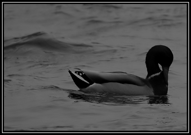
I guess it is too dark, esp. the head being darker than the body, also a shift of the mallard to the left (or its rotation) could improve the impact
the texture of the water is beautiful |
|
| Photographer found comment helpful. |
|
|
01/27/2007 05:43:49 PM |
|
elegant, understated... sublime in its way. 9 bump to 10. there's nothing better in this challenge. |
|
| Photographer found comment helpful. |
|
|
01/27/2007 09:34:46 AM |
|
Nice composition but the image feels too dark to me. |
|
| Photographer found comment helpful. |
|
|
01/25/2007 09:41:25 PM |
|
|
|
01/25/2007 01:02:18 PM |
|
this shot in my opinion needs a boost in brightnes,i would position the duck moving from the left to right,as its left with nowhere to go.good luck. |
|
| Photographer found comment helpful. |
|
|
01/25/2007 10:05:00 AM |
|
This shot looks to have a good focus but it is rather dark. Also I prefer to have more space in front of the subject than behind it, it just seems to give the picture a better balence, imo. |
|
| Photographer found comment helpful. |
|
|
01/25/2007 12:06:46 AM |
|
Lovely capture, but a bit to dark to see much detail on my monitor. |
|
| Photographer found comment helpful. |
|
|
01/24/2007 06:04:17 PM |
|
I keep coming back to this one, because I think there's the start of something really good here. The roughness and texture of the water makes it look really cold and foreboding. But the treatment is just too dark, the head, neck, and chest of the duck just disappear into black. I think I would have gone with a square crop, too, to get the duck more into the middle of the frame, instead of swimming out of it. |
|
| Photographer found comment helpful. |
|
|
01/24/2007 04:11:54 PM |
|
| Photographer found comment helpful. |
|
|
01/24/2007 04:03:34 PM |
|
Maybe it was just not enough light around at the time of the day, still I'd prefer a bit more contrast. |
|
| Photographer found comment helpful. |
|
|
01/24/2007 10:27:40 AM |
|
very dark on my monitor ... |
|
| Photographer found comment helpful. |
|
|
01/24/2007 01:23:12 AM |
|
Interesting perspective. B&W is an unusual choice for what is usually a vibrantly colored bird, though. And I kind of want to see an eye when there is other detail. |
|
| Photographer found comment helpful. |
|
|
01/23/2007 05:24:18 PM |
|
| Photographer found comment helpful. |
|
|
01/23/2007 06:22:10 AM |
|
This is too dark for my taste. |
|
| Photographer found comment helpful. |
|
|
01/22/2007 08:36:09 PM |
|
Needs a little exposure work. |
|
| Photographer found comment helpful. |
|
|
01/22/2007 04:34:16 PM |
|
| Photographer found comment helpful. |
|
|
01/22/2007 02:14:28 PM |
|
I like the composition, but a bit too dark. |
|
| Photographer found comment helpful. |
|
|
01/22/2007 01:29:08 PM |
|
The B&W works well for this shot, but it is too dark. |
|
| Photographer found comment helpful. |
|
|
01/22/2007 11:08:25 AM |
|
needs the contrast pumped up a bit |
|
| Photographer found comment helpful. |
|
|
01/22/2007 08:47:29 AM |
|
| Photographer found comment helpful. |
|
|
01/22/2007 02:06:21 AM |
|
The most appealing thing about mallards (and birds in general) is the color of their plummage. By converting this to B&W it takes away from that. This is also a bit dark (perhaps because of the conversion?). Compositionally it would be better if the duck was going into the frame rather than out of it. |
|
| Photographer found comment helpful. |
|
|
01/22/2007 01:16:34 AM |
|
Sorry, I gave this a 4, too dark and not enough contrast... |
|
| Photographer found comment helpful. |
|
|
01/22/2007 12:32:30 AM |
|
too dark, lacks in details |
|
| Photographer found comment helpful. |
Home -
Challenges -
Community -
League -
Photos -
Cameras -
Lenses -
Learn -
Help -
Terms of Use -
Privacy -
Top ^
DPChallenge, and website content and design, Copyright © 2001-2026 Challenging Technologies, LLC.
All digital photo copyrights belong to the photographers and may not be used without permission.
Current Server Time: 07/02/2026 11:07:54 AM EDT.