| Author | Thread |
|
|
01/17/2007 10:08:44 AM |
|
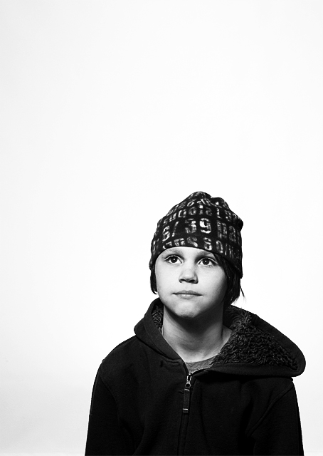
I think this shot is great. I shocks me that it didn't finish in the top 20. I guess to concept of negative space is beyond some voters. |
|
 Photographer found comment helpful. Photographer found comment helpful. |
Comments Made During the Challenge  |
|
|
01/16/2007 04:42:38 PM |
|
I like the lighting and contrast here. Also, the use of negative space IMO adds to the photo. |
|
| Photographer found comment helpful. |
|
|
01/15/2007 08:21:18 PM |
|
This is great. Wonderful composition. I love the hat! |
|
| Photographer found comment helpful. |
|
|
01/14/2007 11:10:49 PM |
|
The empty space works really well here! Nice job. 10 |
|
| Photographer found comment helpful. |
|
|
01/14/2007 08:22:22 PM |
|
Very cool! Love the use of a negative space here! |
|
| Photographer found comment helpful. |
|
|
01/14/2007 03:34:59 PM |
|
|
|
01/14/2007 02:50:45 PM |
|
Great composition with space ! The whole picture is very nicely done .. |
|
| Photographer found comment helpful. |
|
|
01/14/2007 04:52:24 AM |
|
like the composition a lot |
|
|
|
01/13/2007 03:46:32 PM |
|
|
|
01/13/2007 03:01:20 PM |
|
I love this fun simple shot and title. Great use of negative space IMO. Back to bump you up to 8. |
|
| Photographer found comment helpful. |
|
|
01/12/2007 03:12:36 PM |
|
Too much dead space IMO ... zoom in? |
|
|
|
01/12/2007 08:21:53 AM |
|
I like the contrast and the negative space. I think for me I would have preferred the white background to be all white. The dark area lower left is a little bit distracting, but overall I really like it. |
|
| Photographer found comment helpful. |
|
|
01/12/2007 12:12:42 AM |
|
|
|
01/11/2007 11:03:09 PM |
|
Like the negative space. Good expression. |
|
| Photographer found comment helpful. |
|
|
01/11/2007 05:33:43 PM |
|
This photo made me smile, then giggle when I saw the caption. I love the framing and the all white background. Contrast is good. I really like this photo! |
|
| Photographer found comment helpful. |
|
|
01/11/2007 03:01:31 PM |
|
I like the framing in this... all the empty white space really helps paint your story |
|
| Photographer found comment helpful. |
|
|
01/11/2007 04:33:49 AM |
|
|
|
01/10/2007 10:29:49 PM |
|
|
|
01/10/2007 09:25:45 PM |
|
I really like the use of negative space in this composition, but I don't think the subject contains enough interest all by itself. |
|
| Photographer found comment helpful. |
|
|
01/10/2007 07:21:30 PM |
|
Great composition. Great light. |
|
| Photographer found comment helpful. |
|
|
01/10/2007 02:13:27 PM |
|
Too much dead space..would work for a card though. |
|
|
|
01/10/2007 12:04:21 PM |
|
| Photographer found comment helpful. |
|
|
01/10/2007 11:56:49 AM |
|
Very nice. I like the almost lost in white sense of the background. Nice lighting, focus, composition. |
|
| Photographer found comment helpful. |
|
|
01/10/2007 09:47:41 AM |
|
Striking. I like the "breathing space" around the character. Coat a bit heavy on the black side - lost some definition, otherwise an eye-catching composition. |
|
| Photographer found comment helpful. |
Home -
Challenges -
Community -
League -
Photos -
Cameras -
Lenses -
Learn -
Help -
Terms of Use -
Privacy -
Top ^
DPChallenge, and website content and design, Copyright © 2001-2026 Challenging Technologies, LLC.
All digital photo copyrights belong to the photographers and may not be used without permission.
Current Server Time: 06/28/2026 06:15:09 PM EDT.