Shoot, my comment didn't get recorded during the challenge because I didn't finish voting on 20%. Anyway....this was my favorite of the challenge. Made me laugh.
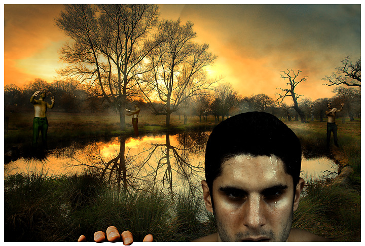
Alex, is that your brother? Dig the shot, nice work, two things though, I would have had your brother wear a shirt or different clothes on the three photos of him in the backround to well maybe make it more realistic that they were three different people and also the hand creeping out of the frame has a much yellower skin tone than the face and that kindof bothers me. Anyway, other than an awesome shot definately one of the best in the challenge :)
Honestly though, I think maybe the one in the front looks a little cut and paste, but regardless, great idea. I really love the concept, and everything behind that guy in the front. Alos love the overlapping border.
Good idea, nice photography and processing work indeed. The only things stopping me from giving a 10 here is the hand is a different color than the face and it looks just a bit unnatural on the tip of the forefinger. Overall the image is fantastic. 9 from me.
Man, I appreciate what you were trying to do with this, but the pond shot is so striking that it actually LOSES its beauty with those video-game-animation-looking zombies in the background. I feel as though the serene beauty of this place has been violated by an overpaid graphic designer. Forgive the harsh words, but perhaps you could experiment with the lighting or textures to make this look more like a true horror destination?
Nicely done - the high colour saturation and cloudy sky both work well to create a fantasy environment and the "zombies" work well too! The hand grabbing the frame of the shot seems a touch too red and rather clumsily cut out but the idea/ effect itself works well.
GREAT use of the expert rules! To me though, the photo is more scary then harsh. I'm sure you'll do good. I'm not voting but I'd give it a 9 - the edit around the fingers hanging over the edge could be better. Your photo would deserve a 10 but it's the little things (so I've learned) that take away from a perfect photo. Attention to detail. Good luck to ya!
All the same character, all the same poses, and the upclose zombie does not look like dead at all. But I like what you did with the environment. Maybe you should have left your self out of it.






 Add photograph to your favorites
 Add photographer to your favorites


 Photographer found comment helpful.


