| Author | Thread |
Comments Made During the Challenge  |
|
|
01/09/2007 11:35:09 PM |
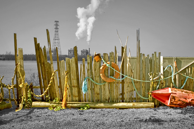
GREAT use of contrasting subjects. It kind of reminds of John Pfahl's "Power Places" series. The selective desaturation also works well.
The one thing I'd like to see is less on the left, so that the smoke, or other point of interest, is more at 1/3 of the frame. Nice. 8 |
|
|
|
01/09/2007 10:11:01 PM |
|
There is a lot of interesting things going on that just keeps you looking. Good job! |
|
|
|
01/09/2007 09:34:00 PM |
|
very dramatic, though the color enhancement is a bit over done...still, I like the concept and the image is powerful. Good Job! |
|
|
|
01/09/2007 12:58:06 PM |
|
Very nice selective desaturation...I love the contrast between the warm colours of the decaying fence and life preserver and the cold gray of the factories. |
|
|
|
01/09/2007 12:27:31 PM |
|
this does not fit the background was it really like this? |
|
|
|
01/09/2007 11:06:28 AM |
|
Not sure I agree with your choice of desat, but it does add interest and life to the photo. But, it also gives the fence a plastic, plopped down feeling that makes it seem out of place, somehow. Perhaps that was your intent. |
|
|
|
01/08/2007 01:55:48 PM |
|
The chaos in front in strong contrast with the background, in color too, and it's very apealing attention |
|
|
|
01/07/2007 01:02:32 AM |
|
Not a fan of the selective desat here, but I do like the composition a lot, and the colors of the fence and related objects are very nice. |
|
|
|
01/04/2007 11:48:01 PM |
|
This is a neat location but I'm not a fan of the editing. Perhaps if you had gone a little more subtle? Like not saturate the fence so much and not desaturate everything else completely, only a bit. |
|
|
|
01/04/2007 04:20:37 PM |
|
I like this... very busy in a subtle kind of way, nice work |
|
|
|
01/04/2007 05:09:04 AM |
|
nice colors and i like the golden glow |
|
|
|
01/03/2007 11:14:29 AM |
|
|
|
01/03/2007 07:50:36 AM |
|
pretty nice, but i dont like the selective desaturation that much. just my taste i guess. |
|
|
|
01/03/2007 01:40:54 AM |
|
This was a really cool way to use different saturations throughout the picture. Cool! |
|
Home -
Challenges -
Community -
League -
Photos -
Cameras -
Lenses -
Learn -
Help -
Terms of Use -
Privacy -
Top ^
DPChallenge, and website content and design, Copyright © 2001-2026 Challenging Technologies, LLC.
All digital photo copyrights belong to the photographers and may not be used without permission.
Current Server Time: 07/15/2026 04:10:33 PM EDT.