|
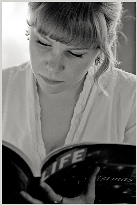
I think you could happily use a little more contrast; whilst there's good range throughout the image, the facial details all seem to fall into the same fairly narrow band of grey. I think that makes the image look slightly washed-out, in the end; and it doesn't sem to me to be that important to see much in the magazine, and the background is already pretty bright, so what is there to lose? |






 Add photograph to your favorites
 Add photographer to your favorites


