| Author | Thread |
Comments Made During the Challenge  |
|
|
01/02/2007 11:48:33 PM |
|
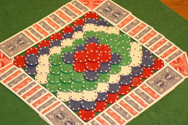
The color cast is keeping me from voting higher. The whites just aren't whites. Tweaking the curves or channel levels would easily fix this. |
|
 Photographer found comment helpful. Photographer found comment helpful. |
|
|
01/02/2007 05:47:02 PM |
|
this is nicely laid out, must`ve taken ages to put together! |
|
| Photographer found comment helpful. |
|
|
01/02/2007 02:10:51 PM |
|
the light here seems a bit "warm", but i like the pattern. |
|
| Photographer found comment helpful. |
|
|
01/02/2007 12:32:27 PM |
|
| Photographer found comment helpful. |
|
|
01/02/2007 10:33:30 AM |
|
The focus here is troubling for me; the entire thing seems out of focus, and while it's a neat idea for a pattern, the bit of floor showing in the upper right corner seems out of place and the background green doesn't work for me. Also, the subject matter isn't well placed in the image field on the whole, I think. |
|
| Photographer found comment helpful. |
|
|
12/31/2006 07:27:40 PM |
|
I like the concept and your layout. Had there not been the brown portioni nthe upper right and a bit more color contrast (seems a bit flat), I would have scored it higher. |
|
| Photographer found comment helpful. |
|
|
12/31/2006 05:20:46 PM |
|
this image totaly looks blurry and there are tons of artifacs on the chips and stuff. Also the white balance seems to be off. Other than that, I really Love the idea concept is great. It could have been framed a bit better, But you have a wonderfull idea. I would like to see this again as your skill progresses. |
|
| Photographer found comment helpful. |
|
|
12/29/2006 07:31:32 PM |
|
| Photographer found comment helpful. |
|
|
12/29/2006 03:18:11 AM |
|
Good pattern, but picture seems a bit washed out. |
|
| Photographer found comment helpful. |
|
|
12/28/2006 04:01:54 PM |
|
the object of the picture is really cool, but the picture itself isn't well lit or focused. |
|
| Photographer found comment helpful. |
|
|
12/28/2006 09:52:13 AM |
|
| Photographer found comment helpful. |
|
|
12/27/2006 07:05:07 PM |
|
I wish the focus were clearer |
|
| Photographer found comment helpful. |
|
|
12/27/2006 02:04:31 PM |
|
the piece of floor/table in the upper right ruins the whole thing....also, too tightly cropped? having the camera directly overhead might have "made" this shot |
|
| Photographer found comment helpful. |
|
|
12/27/2006 01:29:30 PM |
|
Very nice pattern. I think a little more contrast would improve this, or maybe it's the focus that is a little soft. |
|
| Photographer found comment helpful. |
|
|
12/27/2006 10:21:00 AM |
|
I like the idea, but the focus is out or else there is too much noise here. |
|
| Photographer found comment helpful. |
|
|
12/27/2006 03:51:03 AM |
|
wish this was in better light at a different angle |
|
| Photographer found comment helpful. |
|
|
12/27/2006 01:05:47 AM |
|
IMHO focus seems soft and white balance is off. |
|
| Photographer found comment helpful. |
|
|
12/27/2006 12:32:53 AM |
|
It's a great concept but the colors really need some work. Could probably increase the contrast and decrease the brighness to really bring the colors out. Just a thought. |
|
| Photographer found comment helpful. |
Home -
Challenges -
Community -
League -
Photos -
Cameras -
Lenses -
Learn -
Help -
Terms of Use -
Privacy -
Top ^
DPChallenge, and website content and design, Copyright © 2001-2026 Challenging Technologies, LLC.
All digital photo copyrights belong to the photographers and may not be used without permission.
Current Server Time: 06/27/2026 09:11:41 PM EDT.