| Author | Thread |
Comments Made During the Challenge  |
|
|
12/17/2006 07:31:14 PM |
|
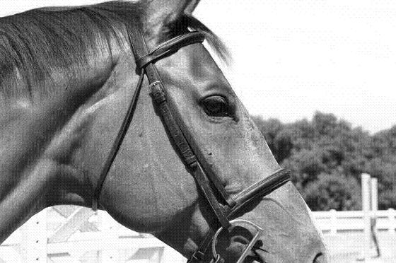
The frame is very awkward. |
|
|
|
12/17/2006 09:52:50 AM |
|
For me, I would have scored this higher if the rest of the horse's nose and the ear were in the photo. I like the use of black and white though. |
|
|
|
12/15/2006 07:08:10 AM |
|
3 - Not really a strong portrait in my opinion. Bigger, if you had the quality, make this better, plus obviously a variation in crop - unless this is intentional. Also, not sure 'what', but seems to be noise and lines/something in this image - could be pixelation issues. |
|
|
|
12/14/2006 10:23:44 PM |
|
|
|
12/14/2006 11:32:37 AM |
|
i wish the nose wasnt cropped off |
|
|
|
12/14/2006 10:26:49 AM |
|
this photo has a "linen paper" look to it ... like my resume does ... wish you'd fit your horse's whole head into the frame also ... |
|
|
|
12/13/2006 10:17:37 PM |
|
Lovely study but its beauty begs for the entire mouth to be visible. 7 |
|
|
|
12/13/2006 06:22:59 PM |
|
Nice but the crop took of a good chunk of your subject's chin and ears. There also appears to be a pattern in the picture (from resizing maybe?) |
|
|
|
12/13/2006 01:43:27 PM |
|
Why are the ears and nose cropped out of this shot? |
|
|
|
12/13/2006 11:01:33 AM |
|
Would like to have seen whole head, not crop out ears and muzzle. |
|
|
|
12/13/2006 07:46:49 AM |
|
Wow, don't have an opportunity to say this much around here but I think this is cropped TOO tightly. |
|
|
|
12/13/2006 04:21:38 AM |
|
I don't like the texture too much.. |
|
Home -
Challenges -
Community -
League -
Photos -
Cameras -
Lenses -
Learn -
Help -
Terms of Use -
Privacy -
Top ^
DPChallenge, and website content and design, Copyright © 2001-2026 Challenging Technologies, LLC.
All digital photo copyrights belong to the photographers and may not be used without permission.
Current Server Time: 06/29/2026 06:30:58 AM EDT.