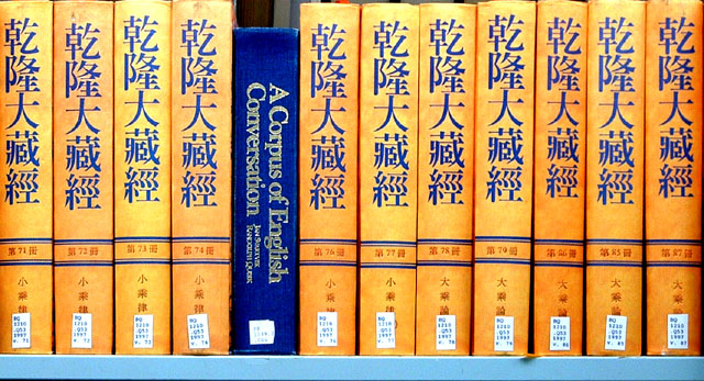
Wonderful image. Really show off the feeling of alone, in a nice unique way. I like both the difference in language and in the color - all of which are very vivid. Great focus. Composition really brings the mood home. Nice work. 7
That's great. I know I'm over analyzing but I like that while the books are very obviously foreign to one another, there is a common color of blue. That brings them together along with the fact that they are both books and both are written.
Pros .. sharp, colorful and fits the challenge well.
Cons .. Almost *too* much contrast .. I can see a dull tone working best here. Also it would be great if all the books were aligned perfectly at the top. I am not sure on the blue bottom ... I think all white in the background and black as the bottom would look great :) JMO
Clever! Good composition and color combination. Maybe I would have cropped it so that the black line at the bottom, on the right and the gap at the very top isn't seen. The gap at the top of the blue book is okay, although the background is a little distracting. I would have gone for a uniform background there - 7.
I understand the idea behind this photo..but visually it doesn't do much for me, just not a very interesting image to look at for an extended period of time.





 Add photograph to your favorites
 Add photographer to your favorites


 Photographer found comment helpful.


