| Author | Thread |
Comments Made During the Challenge  |
|
|
12/12/2006 08:47:06 AM |
|
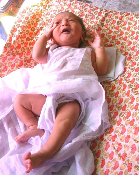
Reducing the overexposure at the top left might enhance the subject. |
|
|
|
12/12/2006 08:24:52 AM |
|
I'm sorry but I couldn't go above 4 on this. The background is so distracting and clashes with the cute baby so much....It kinda looks like a baby was plopped down on a kitchen table cloth and a snapshot was taken. Sorry for the harsh comment but I wanted you to know why I voted 4. In my opinion the baby doesn't engage the viewer because she is looking up and away from the camera. Also the tight crop doesn't work for me. I think it would have helped greatly to have the baby more upright and with a more muted background. One other thing, the upper corners are distracting because the backdrop wasn't big enough. |
|
|
|
12/07/2006 04:51:20 PM |
|
Beautiful baby. The top corner and the cloth behind the baby really detract from the photo. The foucs could have been a bit sharper. |
|
|
|
12/06/2006 09:28:47 PM |
|
awwwwwwwwwwwww she's adorable!!! put a smile on my face after a rough day! |
|
|
|
12/06/2006 12:35:37 PM |
|
The window/ sun light is really harsh, somewhere a bit more shaded would have given maybe a better balance to the lighting. Also taking a bit more care with the composition could have kept that background entirely seamless and cleaned up the top right/left corners. Maybe even getting a bit closer in to capture just the face/ arms would further simplify the shot. |
|
Home -
Challenges -
Community -
League -
Photos -
Cameras -
Lenses -
Learn -
Help -
Terms of Use -
Privacy -
Top ^
DPChallenge, and website content and design, Copyright © 2001-2026 Challenging Technologies, LLC.
All digital photo copyrights belong to the photographers and may not be used without permission.
Current Server Time: 06/28/2026 05:26:28 AM EDT.