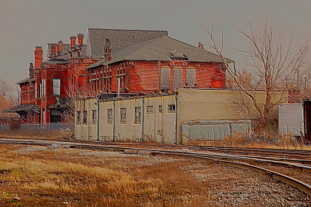
I really like this. Possibly might benefit by a bump of contrast or a more saturated sky - but is a really good subject for texturizing. Nice comp too.
I didn't get around to this photo in my voting on FS XV, because there were too many shots. From me, this would have been in the 6-7 range I think. Quite an impact, unique processing, obscure subject matter with a different viewpoint.
i really like this shot a lot, but i think it could have been processed in another way. i think the real problem with it was it's flat and a lot of edge sharpening. or maybe in this case texture effects created that.i am def. interested in seing the original!
I do like what Julie did for the sky but you have to be careful with that in a challenge - essentially you'd be adding an element that's not there. I also like Falc's suggestion to give it a bit more room on the left, though it does work for me the way it is.
This is another example of a photo that died a DPC death by post-processing, yet I love. You must be gathering a series of photos of old stations for an exhibit, triptych, series or whatever. I suspect these photos will be absolutely brilliant when displayed together, as this and "ghost station" have the same ephemeral feel. Don't let the DPC numbers on these get you down. These photos are unique and highly artistic IMO. Some of my site favorites.
Post- just saw what juliboc did with the clouds. Really makes the photo pop!
JuliBoc, I relly like what you did with the clouds. I wasn't familiar with that. all I did with that picture was increase the saturation and use a sandstone texture. The problem is that I use PSP and may not have the same filters that PS does but I will have to look and see. I don't have any problem with you adjusting my pictures. If you or anyone ever want an original to try some different things with, let me know and I will be glad to send it along. Thanks for showing me the filter.
I like this and gave it an 8. I think I would like it even better if the sky weren't such a flat gray. That seems to flatten the entire image. Did you ever experiment with Filter>Render>Clouds? Take a look at what that does. And please pardon me if I have taken too much liberty with your art.
The composition worries me here. The building is facing left and the way you have cropped this just hems it in a little too tight on the left edge. Whilst on the right you have tried to get the sweep of the track, but have left a wide open space behind the building.
I'm not sure if you could have moved further back and used a longer lens to get the sweeping track and then have the building positioned more to the right of frame.
As it is everything is crowded into the left 2/3 of the image.







 Add photograph to your favorites
 Add photographer to your favorites

 Photographer found comment helpful.


