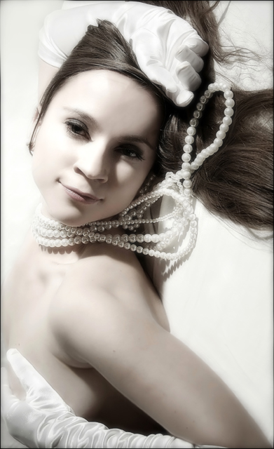
hue/saturation-diffuse glow-filter-sharpen-blur-gaussan blur-dodge-burn-removed some tiny hair with clone
**************************************
I should have called it "too softly" as I wnated:)
I agree about the rotation, but that was the idea. I do not like smooth and nice "model"-like photos. I just do not like them. I wanted it to feel uneasy, a bit weird, a bit too much, a bit too soft. please do not ask me why:)
thank you so much for your comments and votes!
I jsut have learnt that if I want to make it weird it should be totally weird, if I want it smooth it should be clrealy smooth in a nice way. not something in between as I made.
Statistics
Place: 40 out of 233 Avg (all users): 6.1250 Avg (commenters): 7.5833 Avg (participants): 5.7500 Avg (non-participants): 6.4444 Views since voting: 2889 Views during voting: 427 Votes: 200 Comments: 24 Favorites: 11 (view)
If you want votes at dpc, then you should probably go for the simplest and most obvious 'message',
please don't compromise your style for the voters here. You have a great style - great creativity with your titles - and are WAY too enthusiastic about comments being made here.
You have a GREAT eye, a VERY artistic style, and I'd hate to see you give that up just to gain acceptance here.
Oh, you so totally don't suck. This is magnificent! I like the unease created by the wrong orientation; the softness works well for me; and I like the composition very much. Keep this up and we'll kick you out of the suck league! (Not really - you've got the right attitude even if you are darn good with the camera.)
Svetlana,
This was one of my favorite entries in the challenge. It has a lovely, carefree Audrey Hepburn feel to it. I actually think the softness enhances rather than detracts from the feel of the image. Well done!
The undefined hinterland between weird and not weird is not to be sniffed at. If you want votes at dpc, then you should probably go for the simplest and most obvious 'message', as it should get home to the most. Those that are less easy to define may be more disquieting. Yer pays yer mmoney and yer takes yer choice?
Congratulations on this one, anyway.
Gorgeous glamor image. Composition, lighting and tonality are all top notch. You attention to detail is its strongest point. Though I'm not normally a sepia fan it seems to work well here. (or maybe this is muted color) DPC voters will see this as not having a pure white background and may vote is lower because of that.
Beautiful model and great feel to the image. But I actually like it better in the original orientation (looking at my screen sideways). Also, I wish there were a little more light on her eyes, both for catchlights and just to see the eyes better.
Pros: hey wow, love the composition, a really complete picture. tons/lighting perfect, perspective
Cons: not much really, you've done a good job taking the focus away from the dark so can't minus for that at all
Score: 9






 Add photograph to your favorites
 Add photographer to your favorites

 Photographer found comment helpful.


