Author Thread Comments Made During the Challenge
Post actions
The DOF seems too narrow in this shot and makes it feel out of focus
Post actions
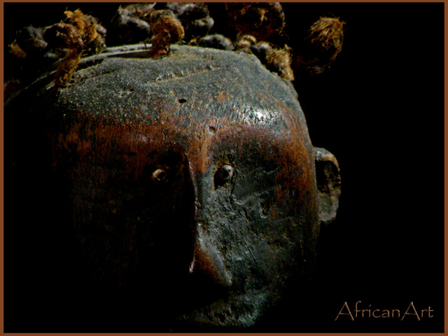
Sorry, this is way too dark. I brightened my monitor as much as I could and it's still hard to see.
Post actions
Looks very much like a card you'd find in a gallery.
Post actions
This is very good. I think it could, however, be lightened a little more (as a whole).
Post actions
would have liked to see more detail in the art. And a little more focus.
Post actions
Great idea, but it seems to get lost. Maybe some other images or textiles in the shadows?
Post actions
I like the idea and the composition, but find it a little too dark with too much lost detail.
Post actions
The image looks blurry to me. ALso, it could use just a tad more lighting to define it. Not necessarily brighter, but more definition.
Post actions
Very nice. Good museum postcard.
Post actions
Interesting subject but too dark IMHO.
Post actions
a bit too dark ... hard to make out any details ...
Post actions





 Add photograph to your favorites
 Add photographer to your favorites


 Photographer found comment helpful.


