marie, I have a comment, but it has nothing to do with the portrait technically (which I think is done quite nicely). If i had been voting on this image, I wouldn't have given it a high score because the emphasis of the capture appears to be a portrait of your husband. There's not enough emphasis on the headwear! it kind of blends into the background. When I vote in a challenge, I'll make a first pass very quickly, looking for the extremes. The image is only on my screen for a short time, and it must speak to me in those seconds. My highest scores go to the images that make me spend some time giving it a long look. Something catchy (composition, lighting, subject, humor, etc). A minor technical detail such as a slightly blown highlight might stop you from getting a 10, but it won't make it a 5! just my 2 cents. steve
Your teammate here from the 400D Club!
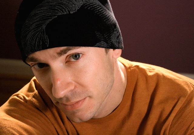
You have definitely used the cam nicely here. I think you lighting to capture the eye was excellent. It is the first place my eye is drawn to when looking at the pic. I really like the composition & the crop here. It looks very thoughtful and I appreciate it.
As mentioned in an earlier comment, there are some blown out parts to the right of your hubby (very cute by the way) that is a bit distracting, particularly the one below the ear. Also, the BG, mostly the white bar running a bit diagonally, is a tad off putting. A bit of a colour clash with the purple as well but just in a minor way. BGs are easily overlooked as a component in enhancing a pic.
Overall, I think that this is a nice shot. I really like that you took a bunch of shots & chose the one YOU liked the most. Good shooting friend!
I think it got a good score considering the picture, I agree with the post processing, could have helped for half a point, but a creative shot would have really brought it up another full point. Nice portrait nonetheless, I think people were just looking for more then just a portrait shot.
this, overall, is a very nice portrait... with advanced editing, you could have helped it quite a but, but with basic, i think there were three things that pushed people to click 5 over 6 :
1) the light on the shoulder's a little harsh... not much... just a little.
2) the background's a distraction. a solid white would have been nice to bring out the dark hat.
3) hat to point this one out, but it's there... a little makeup over the uh... blimish on his nose would have helped... in advanced you could have cloned it out, but in basic we have to think a little bit ahead...