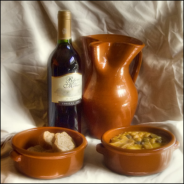
Good lighting and colors, but the wrinkles in the muslin are a bit distracting. Placing the subjects a little farther in front of the backdrop may help that. Composition overall looks pretty good.
Just looking at the image makes me hungry! I like the set up and color tones, I think ironing the sheet and getting a litlle sharper focus and better lighting on the label would have made this image score a little better. Good luck in the challenge.
Nice colors.First of all, let me say I am an amateur and relatively new to dpc, but if this doesn't score as you had hoped, here are some things you might consider. It is usually good to have an odd number of objects in a grouping. If you had only three, or added a fifth, and moved them to the right rather than having the group centered and almost bilateral it would be more pleasing to the eye. The soup and bread does look yummy!
My eye keeps going to the crumpled backdrop. I find it distracting. Also I think the lable and bread are a little too bright. Still it is a nice composition, and the highlights on the terracotta are good. IMHO
The image is sharp and has nice color however a few things are holding this back. First the lighting is a bit too harsh. I'd really try and diffuse it so that you get softer highlights. Second, the background is a distraction. The folds you have in them work well for this sort of shot just not the hard edge wrinkles. Lastly, the noise is an issue. This sort of shot needs to have a more classy feel and the noise just doesn't go with that. Perhaps that was just an ISO mistake?
Fun concept. The wrinkles in the cloth are distracting, though. It's too bad because you had some neat interplay going on with the light and shadows where the folds are. 5






 Add photograph to your favorites
 Add photographer to your favorites


