| Author | Thread |
Comments Made During the Challenge  |
|
|
10/18/2003 07:07:20 PM |
|
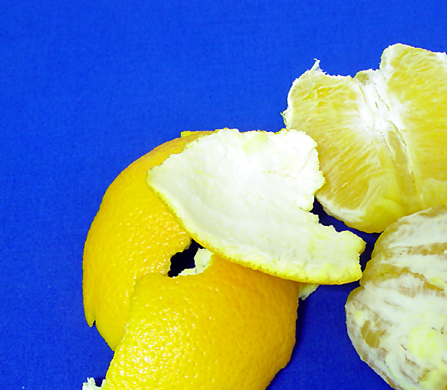
I like your background color choice, it works well with the fruit. The lighting seems a bit bright, or maybe the photo is overexposed a tad bit. The image looks somewhat grainy to me. Nice idea for this challenge... |
|
 Photographer found comment helpful. Photographer found comment helpful. |
|
|
10/15/2003 08:47:05 PM |
|
Okay, unless my monitor is way off, this is a lemon or grapefruit? Because it's coming up yellow and if it's a lemon or grapefruit, isn't your title a little "off" :) Don't you mean sour exposure? :) As for the shot, I love it, the yellow on the blue is a wonderful contrast of primary colors and the cropping, the fuit part way out of the shot is very well done. It does seems just a tad bright to me but it might just be the yellow coloring that's causing that effect. I'm starting this one at an 8 but I will be back. |
|
| Photographer found comment helpful. |
|
|
10/14/2003 07:21:08 PM |
|
I'm hoping that is an orange, as it looks like a lemon on my monitor! :) Good concept though. |
|
| Photographer found comment helpful. |
|
|
10/14/2003 07:19:54 PM |
|
I like the idea of this picture very much but the orange is a little too yellow and not very sharp. |
|
| Photographer found comment helpful. |
|
|
10/13/2003 02:11:48 PM |
|
Nice contrast of colors! Whites are close to be overexposed, maybe, and the background looks a bit noisy. |
|
| Photographer found comment helpful. |
|
|
10/13/2003 12:34:50 PM |
|
Great idea and nice composition. Light is just too harsh. Fits the challenge. |
|
| Photographer found comment helpful. |
|
|
10/13/2003 11:24:14 AM |
|
The color in this image is quite powerful... almost too powerful. The presentation of the lemon seems a bit weak. The color contrast in the image is more powerful than the subject itself. |
|
| Photographer found comment helpful. |
|
|
10/13/2003 06:30:15 AM |
|
A very noise background, overexposed peel and poor colour capture are all distracting. |
|
| Photographer found comment helpful. |
|
|
10/13/2003 05:51:01 AM |
Good Points: good choice of colors
Bad Points:edges are too sharp. color is too high and composition is clumsy
Score:2 |
|
| Photographer found comment helpful. |
|
|
10/13/2003 01:13:49 AM |
|
I think the blue background is too intense and draws the eye away from the interesting details of the peel and the fruit. a composition concentrating more on the subject and less on the bright background would improve things. |
|
| Photographer found comment helpful. |
|
|
10/13/2003 01:01:47 AM |
|
nice macro. Wonderful choice of contrasting colors. Very vivid. Good job! |
|
| Photographer found comment helpful. |
Home -
Challenges -
Community -
League -
Photos -
Cameras -
Lenses -
Learn -
Help -
Terms of Use -
Privacy -
Top ^
DPChallenge, and website content and design, Copyright © 2001-2026 Challenging Technologies, LLC.
All digital photo copyrights belong to the photographers and may not be used without permission.
Current Server Time: 07/16/2026 03:39:50 AM EDT.