| Author | Thread |
Comments Made During the Challenge  |
|
|
10/18/2003 07:10:48 PM |
|
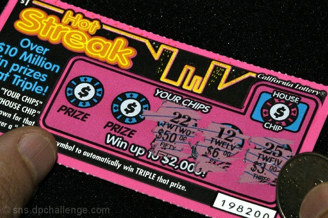
Now this is a really good concealed/exposed idea. The lighting is good, composition is good. The image seems a bit grainy to me... 7 |
|
|
|
10/16/2003 05:35:07 PM |
|
So? DID YOU WIN????? :) Great idea, exposing the numbers. The cropping is also well done, takes you from one side to the other and helps bring you into the shot. The lighting seems just a bit dark to me and the background, with the speckles, though I'm thinking that is the dust from the ticket maybe, is a bit distracting. I"m starting this one at a 7 but I will be back. |
|
|
|
10/14/2003 02:52:00 PM |
|
Interesting idea and good use of color :) |
|
|
|
10/13/2003 09:33:39 PM |
|
Definitely meets the challenge. Good idea! Good clarity. |
|
|
|
10/13/2003 06:32:37 PM |
|
Although the background is a little spotty, I think this is a neat concept. The image REALLY makes the viewer want to know what's behind the areas you haven't yet exposed. Cropping is great, but the thumbs and coin look a little too under-lit (from a photography standpoint). Hope you won! :) |
|
|
|
10/13/2003 04:08:23 PM |
Humourous choice of subject - certainly on challenge.
Image wise the lighting is too flat - perhaps a boost to the brightness/contrats settings could give it that bit of a lift. |
|
|
|
10/13/2003 02:08:56 PM |
|
Unique and different idea for the challenge. Light is a little soft, but I believe this works pretty well. |
|
|
|
10/13/2003 07:11:01 AM |
Good Points: 10/10 for idea, nice and unique
Bad Points:white dust at the top is a distraction but I can see why it's there. the light is too dull, fingers are nearly black
Score:7 |
|
|
|
10/13/2003 06:59:42 AM |
|
Good idea, a little grainy and underexposed though. |
|
Home -
Challenges -
Community -
League -
Photos -
Cameras -
Lenses -
Learn -
Help -
Terms of Use -
Privacy -
Top ^
DPChallenge, and website content and design, Copyright © 2001-2026 Challenging Technologies, LLC.
All digital photo copyrights belong to the photographers and may not be used without permission.
Current Server Time: 06/29/2026 05:21:08 AM EDT.