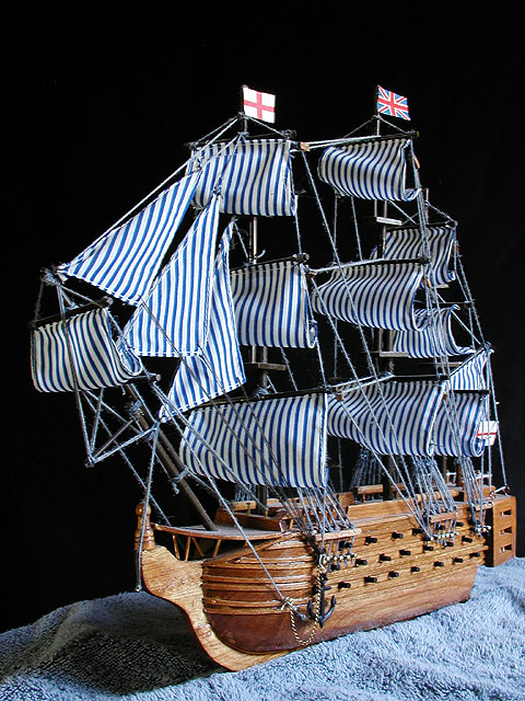
Interesting. (I'm being frank - NOT to offend) The black background is well executed. I don't think that the blue towel (material) does much - maybe to connect with the blue in the sails? Lighting is ok and the the focus is good. 7 Ruthann
Looks more like an collision between a clipper, a coal barge and some pyjamas to me, Victory looks alot different to this. This ship looks quite cute, maybe some humorous touches would help. The towel sea was worth a try, but I think it cheapens it, a proper stand would look better. There are compression effects, particularly on the strings. The light is good, but overexposes the flags a bit, maybe softening it a bit would help.
You know I'm not sure Victory really had stripey sails like that. Lovely model though. Good idea to use a blue towel to represent the sea. Good lighting too.
I Love the shot and I love the idea. But the bath towel looking base spoils it completely. Technically, I can't fault the picture, but (for me) I felt I was looking at the towel more than the wonderful ship… (5)
The blue fabric/towel under the boat is very distracting to me. I would have preferred to see it completely surrounded by black so that it appeared to be floating in air. The shot also feels "crowded" to me. Maybe landscape with a little more negative space to give the boat room to breathe. Hope this makes sense to you. lhall
Something old. Use your photographic technique to emphasize the age of your subject. Composition - good Technical Aspects - good Meets Challenge - looks like a new model of an old ship Visual Impact / Originality - good
Good framing and composition. The blue "sea" is a nice touch. I think if the light was a little more even on the sails, it would be more effective, for me. karmat







 Add photograph to your favorites
 Add photographer to your favorites


