| Author | Thread |
|
|
11/08/2006 08:02:28 PM |
|
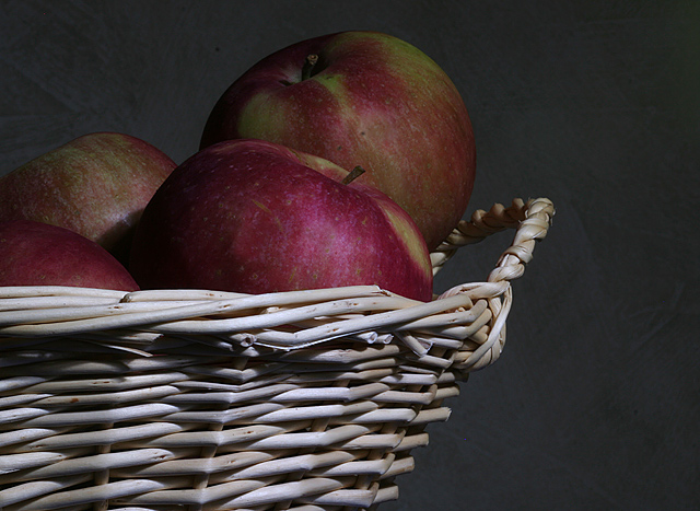
I liked this quite well, actually. Nice, quiet, calm picture. Most of your commenters point out the need for better light on the apples themselves - I agree with that. Basic composition is there, tone (feeling) is there - just a bit needed in the light department maybe. Still, I gave it a 6 and like the muted, soft overall color. |
|
 Photographer found comment helpful. Photographer found comment helpful. |
Comments Made During the Challenge  |
|
|
11/07/2006 03:05:24 AM |
|
I love this, the lighting is perfect and the textures are awesome. |
|
| Photographer found comment helpful. |
|
|
11/06/2006 05:05:47 AM |
|
The basket is exposed well, but the apples are lacking, there color seems washed out and flat. |
|
| Photographer found comment helpful. |
|
|
11/05/2006 09:54:24 PM |
|
I like the crop on this one..... |
|
| Photographer found comment helpful. |
|
|
11/04/2006 05:40:49 AM |
|
i think the background is a little dark for the subject, so it dulls the colours of the apples. |
|
| Photographer found comment helpful. |
|
|
11/04/2006 12:25:33 AM |
|
Great detail on the basket. I think a little more light on the apples would help to bring out the detail there. |
|
| Photographer found comment helpful. |
|
|
11/02/2006 06:53:27 PM |
|
| Photographer found comment helpful. |
|
|
11/02/2006 06:52:15 PM |
|
Nicely composed and good natural color. I think the lighting is the element that is missing for this image; particularly on the basket. It is a bit bright and hot on the wicker and doesn't separate the apples from the background very much. The background on the upper left corner is a bit wrinkly/crinkly or something and that is a distraction. I think you have a great start with this one; just play with the lighting arrangement and see what you can come up with. :) |
|
| Photographer found comment helpful. |
|
|
11/02/2006 05:50:40 PM |
|
The basket seems to overwhelm the apples due to the lighting. I would have focused more of the light on the apples. |
|
| Photographer found comment helpful. |
|
|
11/01/2006 05:16:03 PM |
Subject well focused and focal point: 1
Lighting: 1
Composition: 1
Background: 1
First impression/ Wow factor: 1
Artistic "override": n/a
Total: 5 |
|
| Photographer found comment helpful. |
|
|
11/01/2006 08:00:54 AM |
|
nice shot, I wish it was slightly brighter/more contrast |
|
| Photographer found comment helpful. |
|
|
11/01/2006 06:27:39 AM |
|
I really like the idea here, I'd like to see more light and color. Needs something. |
|
| Photographer found comment helpful. |
Home -
Challenges -
Community -
League -
Photos -
Cameras -
Lenses -
Learn -
Help -
Terms of Use -
Privacy -
Top ^
DPChallenge, and website content and design, Copyright © 2001-2026 Challenging Technologies, LLC.
All digital photo copyrights belong to the photographers and may not be used without permission.
Current Server Time: 07/01/2026 09:50:53 AM EDT.